 Grant Kantsios
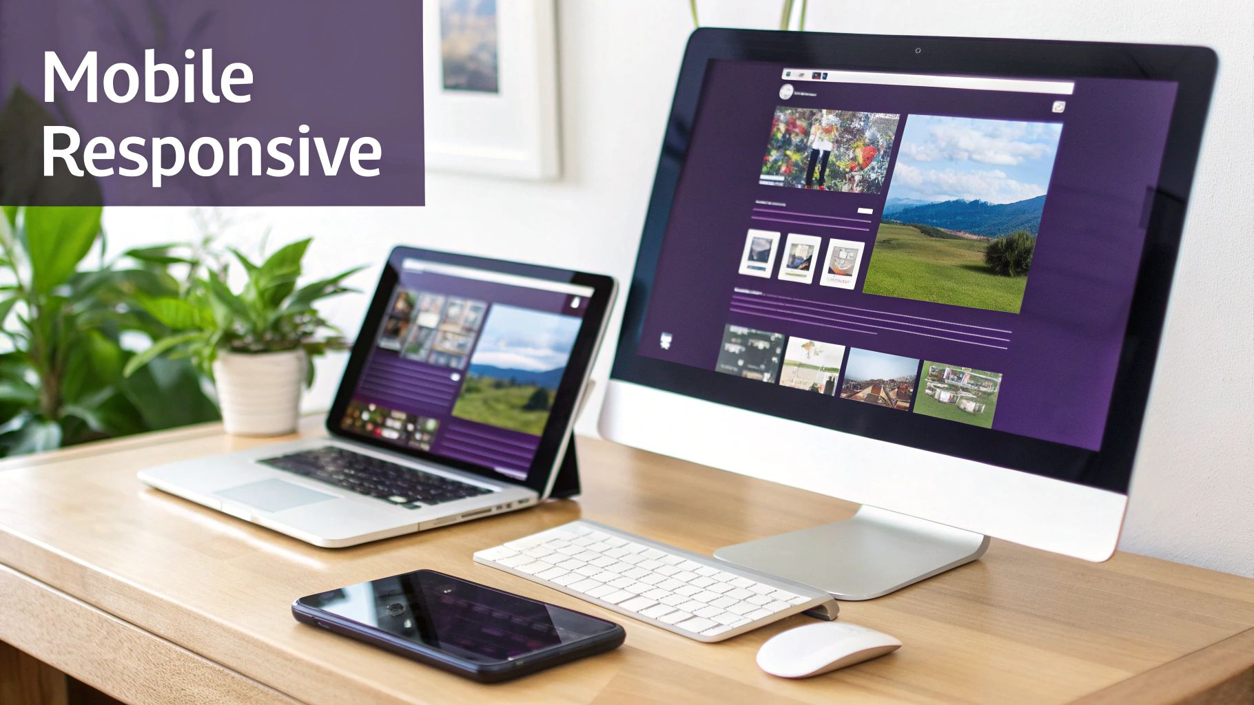
Let’s get one thing straight: mobile responsive design isn't some technical jargon for your web developer to worry about. It’s the simple idea that your salon or spa's website should look and work beautifully on any device a client uses to find you.
Think of it like this: your website should effortlessly flow and adapt, whether someone is browsing your services on a huge desktop monitor at work, a tablet on their couch, or their phone while waiting in line for a coffee.
So, What Is Mobile Responsive Design, Really?
Imagine your website's content is like water. A responsive design is the "smart container" that makes sure the water perfectly fills any glass you pour it into—a tall tumbler, a wide bowl, or a small cup. No spills, no awkward gaps.
This is critical because it gets rid of that awful user experience we've all had: landing on a site on our phone and having to pinch, zoom, and slide the screen around just to read a sentence. It’s frustrating, and it makes a business look instantly outdated.
With over 60% of all web traffic now coming from mobile phones, a website that isn’t responsive is like having a "closed" sign on your digital front door for more than half of your potential clients.
What This Actually Means for Your Business
A responsive website means you only need one version of your site that works everywhere. No separate, clunky "mobile site" from 2010.
It's not just a nice feature; it's the foundation of a modern online presence. It guarantees that every single visitor, no matter how they find you, has a smooth, professional, and frustration-free interaction with your brand.
- Smart Layouts: Content that sits in three neat columns on a desktop will elegantly stack into one scrollable column on a phone.
- Flexible Images: Photos of your beautiful work will shrink or expand to fit the screen without getting distorted or taking forever to load.
- Easy Navigation: The big, detailed menu on your desktop site will transform into a simple, touch-friendly "hamburger" menu (those three little lines) on mobile.
A mobile-responsive design is no longer just a nice-to-have. It’s the bare minimum for a successful online presence. It directly shapes how potential clients see your business and whether they book an appointment with you or bounce to a competitor with a better site.
Responsive vs. Non-Responsive Websites at a Glance
To really see the difference, let’s break down how each type of website stacks up. The contrast is huge, and it has real consequences for how clients find you, how they feel about your brand, and ultimately, your bottom line.
This table cuts right to the chase.
| Feature | Responsive Website | Non-Responsive Website |
|---|---|---|
| User Experience | A flawless, easy-to-use experience on any device. Clients love it. | Makes users pinch, zoom, and scroll sideways. Clients get annoyed and leave. |
| SEO Impact | Loved by Google's "mobile-first" approach, which means better rankings. | Often penalized by search engines, making you harder to find online. |
| Business Impact | Keeps visitors engaged, lowers bounce rates, and drives more bookings. | Leads to high bounce rates, frustrated visitors, and lost clients. |
Looking at it this way, the choice is pretty clear. A responsive website isn't just about looking good—it's about making sure your business can actually compete and win online.
Why a Responsive Website Is Critical for Business Growth

Alright, so you get what mobile responsive design is. But let's connect the dots and talk about what it really means for your salon's bottom line. A responsive website isn't just a techy checkbox to tick off; it's one of your most powerful tools for turning casual browsers into loyal, paying clients.
Picture this: a potential client is on their lunch break, scrolling through their phone, and searches "lash artist near me." They tap on your site, but the booking form is clunky, the text is tiny, and they can’t figure out how to navigate. They aren't going to struggle through it. They're just going to leave and book with your competitor whose site simply works.
This isn't some rare, unlucky scenario. It happens every single day. Lost appointments, abandoned service inquiries, and client frustration are the direct costs of a bad mobile experience. Your website is your digital front door, and if it's a pain to open on the device most people are using, you're literally turning away business.
The Real Cost of a Bad Mobile Experience
When a website isn’t built for mobile, it creates friction at every single step. That friction doesn't just cost you a visitor; it actively damages your brand’s reputation and pushes potential revenue straight to your competitors.
Here are a few all-too-common ways a bad mobile site loses you money:
- Impossible Booking Forms: Think fields that are too small to tap, calendars that don't display right, and confusing layouts that make clients give up before they even schedule.
- Confusing Navigation: If someone can't find your service menu, pricing, or location on their phone in a few seconds, they’ll assume your business is just as disorganized.
- Painfully Slow Load Times: A site loaded with huge, unoptimized images can take forever to load on a mobile connection. Impatient visitors will hit the "back" button before they ever see your work.
For business owners, the message is crystal clear: a seamless mobile experience builds trust and directly drives sales. It signals that you are professional, modern, and care about your clients' time and convenience.
Google Prioritizes Mobile, and So Should You
Beyond the immediate client experience, responsive design is absolutely crucial for getting found in the first place. Google now uses mobile-first indexing, which is a fancy way of saying it primarily looks at the mobile version of your website to decide how to rank you in search results.
The numbers don't lie. The web design services market, valued at a whopping $11 billion in 2023, has exploded for this very reason. With mobile traffic now making up around 60% of all web traffic, it's obvious where your focus needs to be. Businesses with mobile-optimized sites can see their conversion rates jump by about 40%, while a poor mobile design can cause bounce rates to soar up to 60%.
At the end of the day, investing in a responsive website isn’t an expense—it's a core business strategy. It protects your brand, attracts new clients, and secures your growth in a world that lives on its phones.
The Three Pillars of Effective Responsive Design
You don't need to be a developer to get what responsive design is all about. You just need to understand the three core principles that make the magic happen. Think of them as the foundation, walls, and roof of a smart, adaptable digital home for your beauty business.
These three techniques work together to create an experience that feels seamless, whether your client is on a giant desktop monitor or their phone.
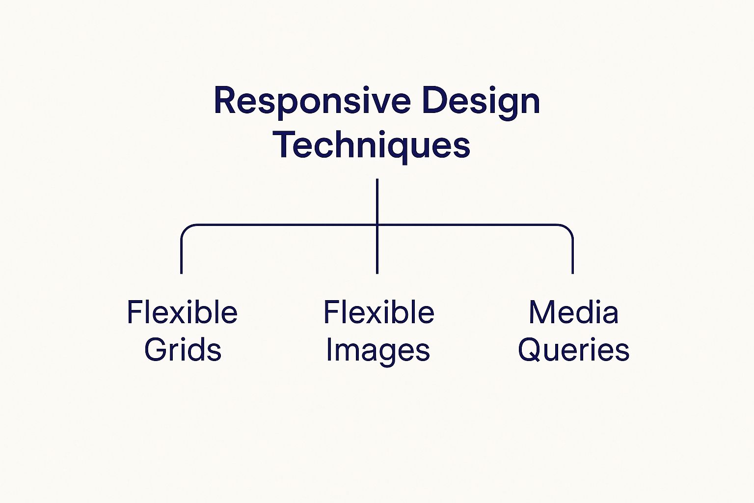
This little diagram breaks it down perfectly: fluid grids, flexible images, and media queries are the essential building blocks that make responsive design work.
Fluid Grids: The Elastic Framework
Imagine your website's layout is built on a grid of invisible columns, kind of like a spreadsheet. A traditional, non-responsive site uses a rigid grid where everything has a fixed width. When you shrink the screen on one of those sites, content gets awkwardly cut off or forces you to scroll sideways. It’s a mess.
A fluid grid is the smart solution. It uses percentages instead of fixed pixels for its columns. So, if your main content area takes up 70% of the screen and a sidebar takes up 30%, they will always maintain that proportion. They gracefully stretch or shrink to fit any screen perfectly. No more weird cut-offs.
Flexible Images: Visuals That Adapt
You’ve definitely seen this before: you pull up a website on your phone, and the images are enormous, forcing you to pan around just to see the whole picture. That's what happens when images have fixed dimensions—they don't know how to resize themselves for a smaller space.
When you combine fluid grids with flexible images, you’re making sure the core structure and the visuals on your website are a team. This creates a cohesive, professional look, no matter what device a client is using.
Media Queries: The Smart Traffic Cop
This is the final, crucial piece of the puzzle. Think of media queries as a smart traffic cop for your website. They're simple rules that tell your site how to behave based on the size of the screen it detects.
They work by checking specific conditions, like the screen width, and then applying a set of styles. It works like this:
- "If the screen is wider than 1024 pixels…" show the full three-column desktop layout.
- "If the screen is between 768 and 1023 pixels…" switch to a two-column tablet layout and bump up the font size.
- "If the screen is narrower than 767 pixels…" stack all the content into a single column and transform the navigation menu into a mobile-friendly icon.
These three pillars work in harmony to deliver that seamless experience every user wants. Now that you get the basic concepts, you can have more informed conversations with developers and even apply these ideas to your own site. For more layout inspiration, check out our guide on website design best practices.
How to Make Your Website Mobile Responsive

This section provides actionable steps business owners can take to ensure their site is mobile-friendly. We'll cover everything from testing your current site to implementing key changes.
Step 1: Test Your Current Website
You can't fix what you don't know is broken. Before making any changes, get a clear picture of your site's current mobile performance.
- The Quick Check: On your desktop, open your website and shrink your browser window. Does the content rearrange itself neatly, or does it get cut off? This simple "drag test" is a great first indicator.
- The Official Test: For a definitive answer, use Google's free Mobile-Friendly Test tool. Just enter your website's URL. It will give you a clear "pass" or "fail" and highlight specific issues that need fixing.
Getting a green "Page is mobile-friendly" message is a great start. If not, the following steps are your roadmap to getting there.
Step 2: Choose a Responsive Foundation
For most business owners, the easiest and most effective path to a responsive site is to start with a platform that does the hard work for you.
- Actionable Insight: If you're building a new site or doing a major redesign, use a platform like WordPress, Squarespace, or Shopify. Select a theme or template that is explicitly labeled as "responsive." Most modern themes are, but always check the theme's live preview on a mobile device before you commit. This one choice solves 90% of your responsiveness problems from the start.
If you're just starting out, our guide on how to create a professional website will walk you through the whole process, step by step.
Step 3: Optimize Images for Fast Mobile Loading
Large, unoptimized images are the #1 cause of slow mobile websites. A client won't wait for your beautiful photos to load; they'll just leave.
- Actionable Insight: Before you upload any image to your website, run it through a free compression tool like TinyPNG. It drastically reduces the file size without sacrificing quality. Also, make sure to upload images at the size they will be displayed. Don't upload a massive 4000-pixel-wide image for a space that is only 800 pixels wide.
A fast website isn't just a nice-to-have; it's essential. Studies show that over half of mobile visitors will bounce if a page takes more than three seconds to load.
Step 4: Simplify Navigation and Make Buttons Tappable
A desktop menu with lots of options becomes a cluttered nightmare on a small screen. Your goal is to make it effortless for someone to find what they need using their thumb.
- Actionable Insight: Review your main navigation menu. Can you simplify it to 4-5 essential items? For mobile view, ensure your theme uses a "hamburger" icon (three lines) to tuck the menu away neatly. Most importantly, check that your buttons ("Book Now," "View Services") and links are large and have plenty of space around them so they are easy to tap. A good rule is to make tap targets at least 44×44 pixels.
Common Responsive Design Mistakes That Will Send Clients Running
So, you’ve got a responsive website. Check. But just because it technically works on a phone doesn’t mean it’s not secretly frustrating potential clients. Think of it like a beautiful salon with a front door that’s incredibly hard to open—people will just give up and go elsewhere.
Let’s talk about the common design traps that can make your mobile site a total nightmare for users, and how to sidestep them.
One of the biggest culprits? Teeny-tiny fonts. If someone has to pinch and zoom just to read about your services or check your prices, you've already created friction. Reading your site shouldn't feel like an eye exam. They'll get annoyed and bounce faster than you can say "book now."
And then there’s the dreaded mobile pop-up. On a desktop, clicking that little 'X' is no big deal. On a phone, it's a whole different story. When the close button is microscopic, hidden, or just plain stubborn, it feels like being trapped. Most people won't stick around to solve the puzzle; they'll just close the tab and forget you exist.
Stop Hiding the Good Stuff
A really common mistake I see is when designers try to "clean up" the mobile view by just hiding content. They'll remove testimonials, detailed service descriptions, or even the contact form, thinking it makes the page look less cluttered. This is a huge misstep. It basically tells the majority of your visitors that they're getting a watered-down, second-class experience.
The point of responsive design isn’t to slash your content for mobile users. It’s to reorganize it so it’s easy to digest on a smaller screen. Every piece of info that helps a client decide to book should be right there, no matter what device they're using.
Instead of amputating sections of your site, use smart tools like accordions or "read more" toggles. This keeps the initial view clean and scannable but lets curious clients tap to expand sections for all the juicy details. Simple, clean, and effective.
Think Like a Real Person, Not a Robot
At the end of the day, these mistakes happen when we forget how real people actually use their phones. They're on the go, often distracted, and have zero patience for a clunky experience.
The data doesn't lie: 72% of users say they want mobile-friendly sites, and a whopping 73.1% of people will leave a site if it’s not designed well for their device. You can dive deeper into these mobile trends over at Statista.com. It's not just about looking good; it's about keeping people engaged long enough to book with you.
Ready to fix these fun-killers? Here’s your checklist:
- Use Fonts a Human Can Read: Your body text should be at least 16px. No more squinting.
- Test Your Pop-Ups (Mercilessly): Make sure that "close" button is big, obvious, and easy to tap.
- Reformat, Don’t Remove: Use expandable sections to keep all your important info accessible without overwhelming the page.
When you focus on what the user actually wants and needs, your responsive site stops being just a technical checkbox and starts becoming a machine that turns visitors into loyal clients.
Got Questions About Responsive Design? We’ve Got Answers.
Even after getting the rundown on mobile responsive design, it's totally normal for a few questions to pop up. As a business owner, you want to make sure you’re making smart moves for your website without getting lost in all the techy jargon.
Let's tackle the most common questions we hear from beauty pros. We'll give you clear, straightforward answers to help you feel amazing about your digital strategy.
Is “Mobile-Friendly” the Same as “Responsive”?
Not quite, but people often use them interchangeably. The easiest way to think about it is that mobile-friendly is the goal, and responsive design is the best way to get there.
- Mobile-Friendly: This is just a general term that means your site works well on a phone. An old-school way to do this was to create a totally separate, stripped-down mobile site (you might have seen these at an "m.yourwebsite.com" address). It was clunky.
- Responsive: This is the modern, must-have method. It uses a single website and one URL that automatically adjusts its layout to look gorgeous on any screen, from a tiny phone to a huge desktop monitor. It’s way better for your SEO and so much easier to manage.
Bottom line: In today's world, a truly mobile-friendly site has to be responsive.
How Can I Check If My Website Is Responsive?
First is the quick "browser drag" test. Open your website on your desktop computer, grab the corner of your browser window, and slowly drag it to make it narrower. A responsive site will beautifully reflow and rearrange its content as the window gets smaller. If text gets cut off or a weird horizontal scrollbar appears at the bottom, it's not fully responsive.
Second, for a more official verdict, use Google’s free Mobile-Friendly Test tool. Just pop in your website’s URL, and it’ll give you a clear "pass" or "fail" in seconds.
How Much Does It Cost to Make a Website Responsive?
This is the classic "it depends" answer. The cost can swing wildly based on where you’re starting.
If you're building a new website, the cost is almost always baked right in. Pretty much all modern platforms like WordPress, Squarespace, and Shopify use responsive themes by default. It's just the standard now.
But, if you have an older, non-responsive site, converting it can cost anywhere from a few hundred to several thousand dollars, depending entirely on how complex it is. Honestly, in most cases, it’s cheaper and smarter to just redesign the whole thing using a modern, responsive framework instead of trying to patch up an outdated site.
For most beauty businesses, starting fresh with a responsive template is the best and most future-proof investment. It ensures your site is built on a solid foundation from day one.
If My Website Is Responsive, Do I Still Need a Mobile App?
For the overwhelming majority of beauty businesses, the answer is a clear no. A responsive website is your non-negotiable foundation; a mobile app is a specialized tool for a completely different job.
Think of your responsive website as your digital storefront. It’s how new clients find you on Google and it's accessible to anyone with a web browser. It's all about discovery.
A mobile app, on the other hand, is for your die-hard fans—the clients who are already loyal to you. It's something they have to actively download and install. Apps are amazing for engaging your repeat customers with things like push notifications for last-minute openings or exclusive loyalty programs. An app is a tool for retention, not discovery.
So, start with a flawless responsive website. It's what will get those clients in the door in the first place.
Ready to build a stunning, responsive website that attracts clients and grows your beauty business? gohappybeauty provides beautiful, SEO-optimized websites designed specifically for professionals like you. Get started with gohappybeauty today!


