What Is a Landing Page? An Essential Guide for Business Owners
Ever heard the term "landing page" in marketing meetings and wondered what it actually means for your business? Let's break it down into simple, actionable steps.
Think of a landing page as a standalone web page built for one single goal—to get a visitor to take a specific action. It’s the first page someone “lands” on after they click a link from your email newsletter, a Google ad, or a post on your salon's Instagram. Unlike your main website, which has many pages and options, a landing page is hyper-focused on getting one job done.
Decoding the Purpose of a Landing Page
Imagine your main website is a bustling department store. It has different floors, endless aisles, and tons of products to browse. A potential client could wander around, get distracted by your blog, and completely miss the special offer you're promoting.
A landing page, on the other hand, is like a pop-up shop. It has one product on display, a single, clear message, and one checkout counter. The entire point is to guide a visitor toward one specific action—what marketers call a call-to-action (CTA)—without any detours.
This focused approach makes landing pages incredibly effective. Instead of sending traffic from a targeted ad to your general homepage, you direct them to a page that continues the exact conversation your ad started. This creates a seamless and much more persuasive experience for your potential customer.
What Makes a Landing page Different
While a landing page is part of your online presence, it's a specialist tool. It plays a different role than your homepage or other pages on your site. If you've invested in a well-designed professional website, you know it serves many purposes. A landing page serves just one.
Here’s a practical breakdown of the key differences between a landing page and your homepage.
Landing Page vs Homepage At a Glance
| Feature | Landing Page | Homepage |
|---|---|---|
| Primary Goal | Single, focused action (e.g., sign up, book now). | General exploration and brand introduction. |
| Navigation | Minimal or none. No distracting links. | Full navigation menu (Home, About, Services, etc.). |
| Content | Tailored to a specific campaign or offer. | Broad overview of the entire business. |
| Traffic Source | Comes from a specific marketing campaign (ad, email). | Comes from various sources (direct, organic search). |
| Call-to-Action | One clear, primary CTA. | Multiple CTAs (e.g., "View Services," "Read Blog"). |
See the difference? One is a tour guide for your entire brand, while the other is an express lane to a specific destination.
A landing page isn't just another page on your website; it's a strategic tool designed to capture leads and drive sales with precision. It eliminates choice paralysis by giving a visitor a clear, direct path to what you want them to do next.
Why Your Beauty Business Needs One
Businesses use landing pages to guide visitors straight into their marketing or sales funnels. It's a proven strategy. In fact, around 43.6% of businesses use them specifically for lead generation, according to stats from Hostinger.
Here's how to apply this to your business: create a dedicated page for each offer—like a discount on a new facial treatment or a sign-up for a lash extension workshop. This lets you tailor your message directly to the audience you're targeting. This direct approach makes it easier to measure how well your marketing is working and, most importantly, turn curious clicks into paying clients.
Why Landing Pages Are a Game Changer for Business
Okay, so we know what a landing page is. But the real magic is in what it can do for your business. For salon and spa owners, these focused pages are powerful tools that turn your ad dollars into actual, measurable growth. How? By creating a straight, simple path from a potential client's interest to a confirmed booking.
Let's walk through a common scenario. Imagine your spa is promoting a new hot stone massage package. You run an ad on social media, but you link it to your main services page. A potential client clicks, ready to book, but they land on a page with everything you offer: facials, waxing, manicures. They might get distracted, click around, and forget why they came. That's a lost booking.
A dedicated landing page prevents this. When someone clicks your ad for the hot stone massage, they land on a page that talks only about that massage package. It highlights the benefits, shows the special price, and has a big, clear "Book Your Massage Now" button. It’s simple, compelling, and makes it incredibly easy for them to say yes.
Your Direct Path to Better Leads and ROI
This laser-focused approach is a conversion powerhouse. Instead of making people hunt for what they want, you deliver it directly. This clarity brings in more qualified leads—people genuinely interested in that specific offer—and means you waste less money on ads that don't perform.
This diagram shows exactly how landing pages deliver results for your business.
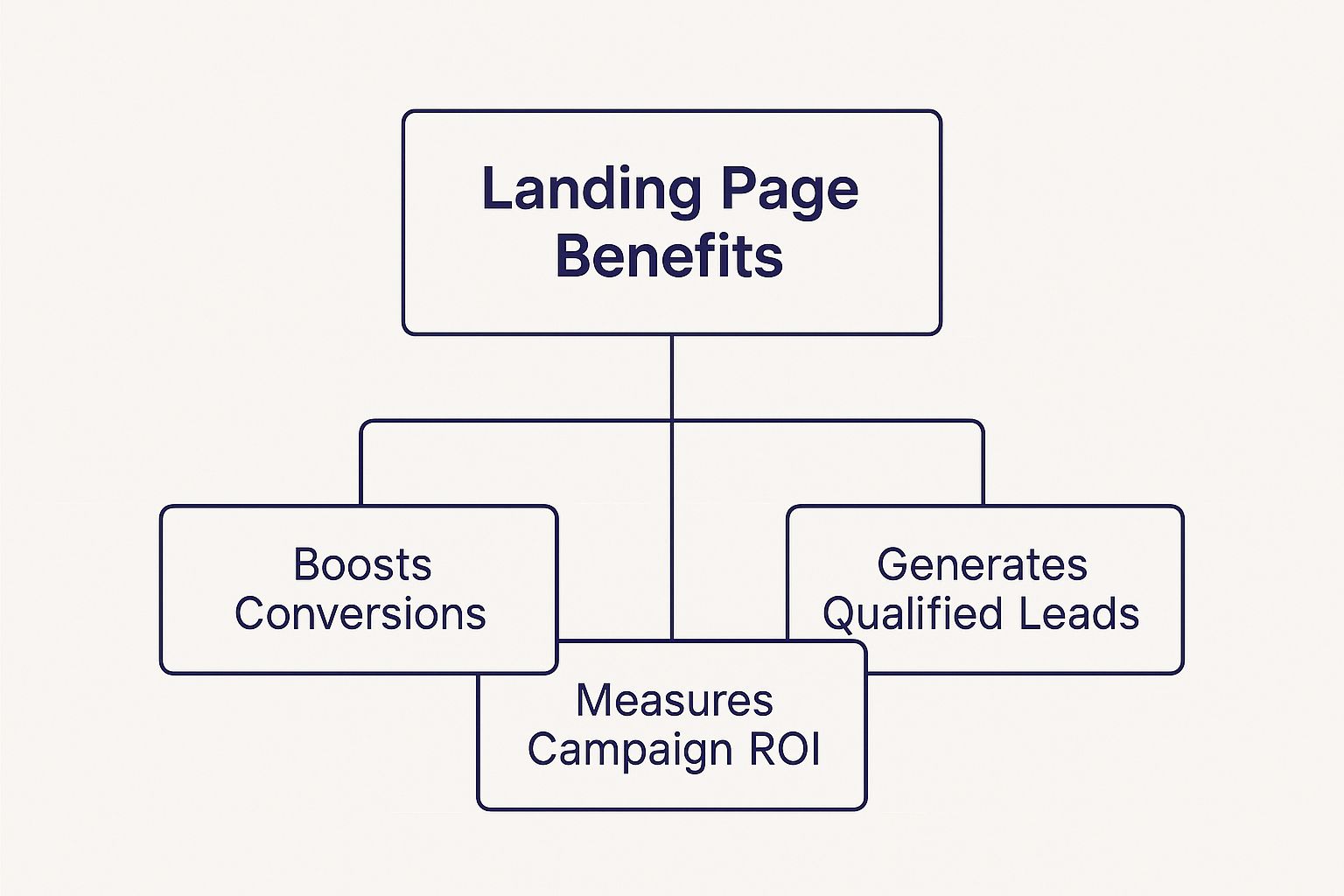
As you can see, every benefit—from boosting conversions to generating better leads and tracking your return—comes from the single-minded focus of a landing page.
Better yet, landing pages give you clear data. You can see precisely how many people clicked your ad, landed on the page, and booked that massage. This direct line from marketing effort to revenue shows you what’s working with your audience. Globally, the average landing page conversion rate is about 6.6%, which proves how effective they are. You can discover more insights about landing page performance on Hostinger if you want to dive into the numbers.
A well-crafted landing page doesn't just attract visitors; it converts them. It serves as your business's most effective salesperson, available 24/7 to close the deal on a single, specific offer.
By giving each marketing campaign its own page, you can test different headlines, images, and offers to see what your clients respond to best. This process of constant improvement helps you sharpen your marketing strategy and get the most out of every dollar you spend.
The Anatomy of a High-Converting Landing Page
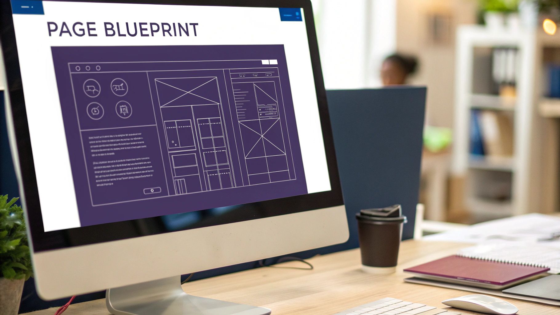
Now that you know why landing pages are your secret weapon, let's look at what makes a great one work. Think of it like a recipe. To get a five-star result, you need the right ingredients in the right measurements.
A high-converting landing page is about strategic simplicity. Every element on the page must work together to guide your visitor toward one goal—whether that's booking a facial or downloading your new style guide. Here's your checklist.
The Magnetic Headline
Your headline is your first impression, and you have about three seconds to make it count. Its job is to convince the visitor to stick around. It must be clear, attention-grabbing, and speak directly to a problem they want to solve. A great headline confirms, "You're in the right place."
- Actionable Tip: Match your headline to the ad or post they clicked. If your ad says "20% Off Our Signature Hydrafacial," your headline should say the same.
- Good Example: "Get Glowing Skin in 30 Days with Our Signature Hydrafacial"
- Bad Example: "Welcome to Our Spa"
Compelling Visuals and Copy
Next, use a high-quality photo or a short video that shows the result your visitor wants. If you're promoting a lash extension service, show a stunning "after" photo, not a picture of your salon's front door.
Your copy should be short, scannable, and focused on benefits, not features. Use bullet points to make the information easy to digest.
- Benefit-focused: "Wake up with flawless, ready-to-go lashes."
- Feature-focused: "We use synthetic mink fibers."
Actionable Tip: Write for your customer. They care about the confidence boost they'll get, not the technical specs. Keep your language simple and persuasive.
The best landing pages get straight to the point. They understand that less is more. In fact, research shows that shorter pages with a super clear call to action can outperform longer, more complicated ones by as much as 13.5%.
The Irresistible Call-to-Action (CTA)
The Call-to-Action (CTA) is the most important element. This is the button your visitor clicks to take the final step. It must be impossible to miss, with a contrasting color that makes it pop.
The text on the button needs to be action-oriented and specific. Tell people exactly what will happen when they click it.
- Actionable Tip: Use command verbs that promise value.
- Good Example: "Book My Free Consultation" or "Claim My 20% Off"
- Bad Example: "Submit" or "Click Here"
The CTA is the finish line. Make it exciting, not a chore. Many of these principles also apply to creating a high-converting contact page.
Trust Signals and Social Proof
Finally, you must build trust quickly. People are hesitant to share their information without feeling confident in your business. This is where trust signals are essential.
Actionable Tip: Sprinkle these elements near your CTA button:
- Customer Testimonials: Short, powerful quotes from happy clients.
- Star Ratings: A quick visual cue that shows people love your service.
- "As Seen In" Logos: If you’ve been featured in local blogs or magazines, show it off!
These provide social proof. They show visitors that other real people have trusted you and had a fantastic experience. It’s the online version of a word-of-mouth recommendation and can significantly boost your conversion rates.
Actionable Tips to Optimize Your Landing Page
Getting your landing page live is the first step, but the real success comes from optimization. Think of your page not as a "set it and forget it" project, but as a tool you can constantly improve. Here are simple, actionable ways for business owners to boost performance.
One of the best methods is A/B testing. This sounds technical, but it’s simple: you create two versions of your page (an 'A' and a 'B' version) with just one element changed. Maybe it’s a different headline, a new button color, or a different photo. You then show each version to half your visitors and see which one performs better. This takes the guesswork out of improving your page.
Start with Smart A/B Tests
When you begin A/B testing, focus on the big-impact elements. The golden rule is to only test one thing at a time. If you change the headline, image, and button color at once, you won’t know which change made the difference.
Here are three easy tests you can run first:
- Test Your Headline: Pit a benefit-focused headline ("Get Flawless Lashes Today") against a question ("Ready for Flawless Lashes?"). See which one grabs more attention.
- Change Your CTA Button: Try different text (e.g., "Book Now" vs. "Claim My Spot") or a different color. A simple color swap can often increase clicks.
- Swap Your Main Image: Test a picture of a happy client against a beautiful shot of your salon's interior. See which visual creates a stronger emotional connection.
These experiments provide priceless insights into what motivates your customers. For a deeper look, check out our guide on conversion rate optimization best practices.
Personalize the Visitor Experience
Personalization is a game-changer. Instead of showing every visitor the same page, you can tailor the experience based on where they came from.
Actionable Tip: Ensure message match. If someone clicks your Instagram ad for a discount on lash extensions, your landing page headline should immediately confirm that exact offer. This makes visitors feel they’re in the right place.
Customizing the experience makes visitors feel seen and instantly confirms they’re in the right spot. It’s a small touch that can have a huge impact on your bottom line.
In fact, using personalized calls-to-action can boost conversion rates by an incredible 42% or more. This strategy helps you match what your visitor is looking for, making them far more likely to take the next step.
Finally, always write copy that screams benefits. Don't just say your facial uses "hyaluronic acid"; say it "delivers deep, lasting hydration for glowing, youthful skin." To sharpen your messaging, you can use tools like AI prompts specifically designed for landing page copy optimization. And don't forget the basics: make sure your page loads lightning-fast and looks amazing on a phone—that’s where most of your clients will find you.
Real-World Landing Pages That Just Work
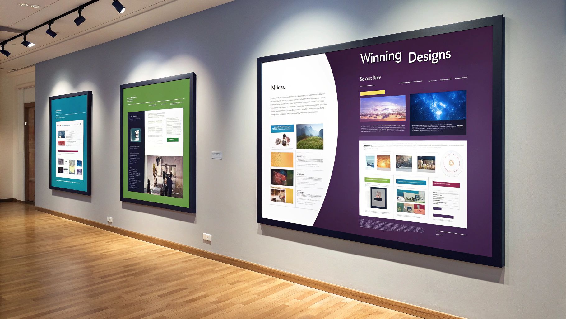
Theory is great, but seeing how these ideas work in the real world is where the learning happens. Let's analyze some winning landing pages and break down why they're so effective.
These pages aren't just pretty; they are conversion machines built with a clear goal. They know their audience, eliminate distractions, and guide visitors straight to the finish line. Learning from them is the fastest way to get inspired.
A Masterclass in Simplicity
Some of the most powerful landing pages are shockingly simple, especially for lead generation. They often open with a bold headline that speaks directly to a visitor's biggest pain point or desire.
From there, you'll see a few concise, benefit-packed bullet points that are easy to scan. You won't find any navigation links, sidebars, or other distractions. The entire page is laser-focused on a single, impossible-to-miss call-to-action button.
The secret to a great landing page is that it removes choice. It creates a single, streamlined path from the ad click to the action, making the decision to convert feel both easy and obvious.
This approach works. To see this in action, look at a Google Ads Lead Form example and notice how direct and frictionless the entire process is.
Using Visuals and Social Proof to Win Trust
Another killer strategy is to lead with a big, gorgeous hero image or video that creates an instant emotional connection. For a beauty business, this could be a short clip of a relaxing spa treatment or a stunning "after" shot of a client radiating confidence.
But a great visual is only half the battle. The best pages pair it with powerful social proof. Here’s why that combination is so effective:
- Powerful Testimonials: Short, authentic quotes from happy customers are placed right next to the CTA button to build trust at the moment of decision.
- Clear Star Ratings: A simple visual cue that instantly communicates satisfaction.
- "As Seen In" Logos: Featuring logos from media outlets or well-known partners lends immediate credibility.
This combination works because it answers the visitor’s unspoken question: “Can I trust this business to give me the results I’m looking for?”
Driving Ecommerce Sales with Unbreakable Focus
For ecommerce brands, landing pages are critical for maximizing revenue from a specific campaign. The best ones don't just dump you on a generic product page; they build a compelling case for buying right now. Think clear headlines, stunning product photos from every angle, and descriptions dripping with benefits.
This focused environment makes a massive difference. While the median conversion rate for ecommerce landing pages is 4.2%, top performers hit rates over 11.4%. That’s nearly triple the average and can easily translate into thousands of extra sales.
Your Landing Page Questions Answered
We've covered what a landing page is and why it's a non-negotiable for your business. But you probably still have some practical questions. Let's get them answered with straightforward, no-fluff advice for business owners.
How Much Does It Cost to Create a Landing Page?
The cost can vary, but you have options for any budget. The price depends on how you choose to build it.
- DIY Builders: To keep costs low, tools like Carrd or Mailchimp offer plans starting at just a few dollars a month. They are perfect for simple, focused pages and are designed for non-coders.
- Hiring a Pro: For a custom design, you can hire a freelance designer or an agency. This could run from a few hundred to several thousand dollars, depending on the project's complexity.
The price is influenced by design complexity, custom coding, and whether you need advanced features like A/B testing or integrations with other software.
Do I Need a Full Website to Have a Landing Page?
This is a great question with a simple answer: No, you don't!
While landing pages work great with a full website, they can also stand alone. This is a brilliant strategy for a new business that isn’t ready to invest in a large, multi-page site. It's also perfect for testing a new service or running a quick promotion without altering your main website.
What Are the Best Tools for Building a Landing Page?
For most business owners, user-friendly landing page builders are the best option. These platforms are designed with simple drag-and-drop editors, so no technical skills are required.
Some of the most popular and respected tools include:
- Leadpages: Known for its library of high-converting, easy-to-customize templates.
- Instapage: Praised for its powerful A/B testing and personalization features.
- Unbounce: A powerhouse with amazing design flexibility and many integrations.
These tools handle the technical side, so you can focus on your message and offer.
How Many Landing Pages Should My Business Have?
Here’s the golden rule: create a unique landing page for every single campaign, offer, or audience.
If you're running one ad for a bridal makeup package and another for a teen prom special, each one needs its own dedicated page. Do not send them both to the same place.
Why? Because relevance is everything. When the headline on your landing page perfectly matches the ad that brought someone there, it creates a smooth, persuasive experience. It makes them feel like they're in exactly the right place, and they'll be far more likely to take you up on your offer.
This targeted approach ensures your message always hits the mark.
Ready to create a stunning, high-converting website for your beauty business? gohappybeauty provides beautiful, SEO-optimized websites designed specifically for professionals like you. Get started today and turn your online presence into your most powerful marketing tool. Learn more at gohappybeauty.com.
Grow your beauty business
Our focus is, and always will be, helping you improve your online presence and generate more business from your website. That is what we do, for you.
