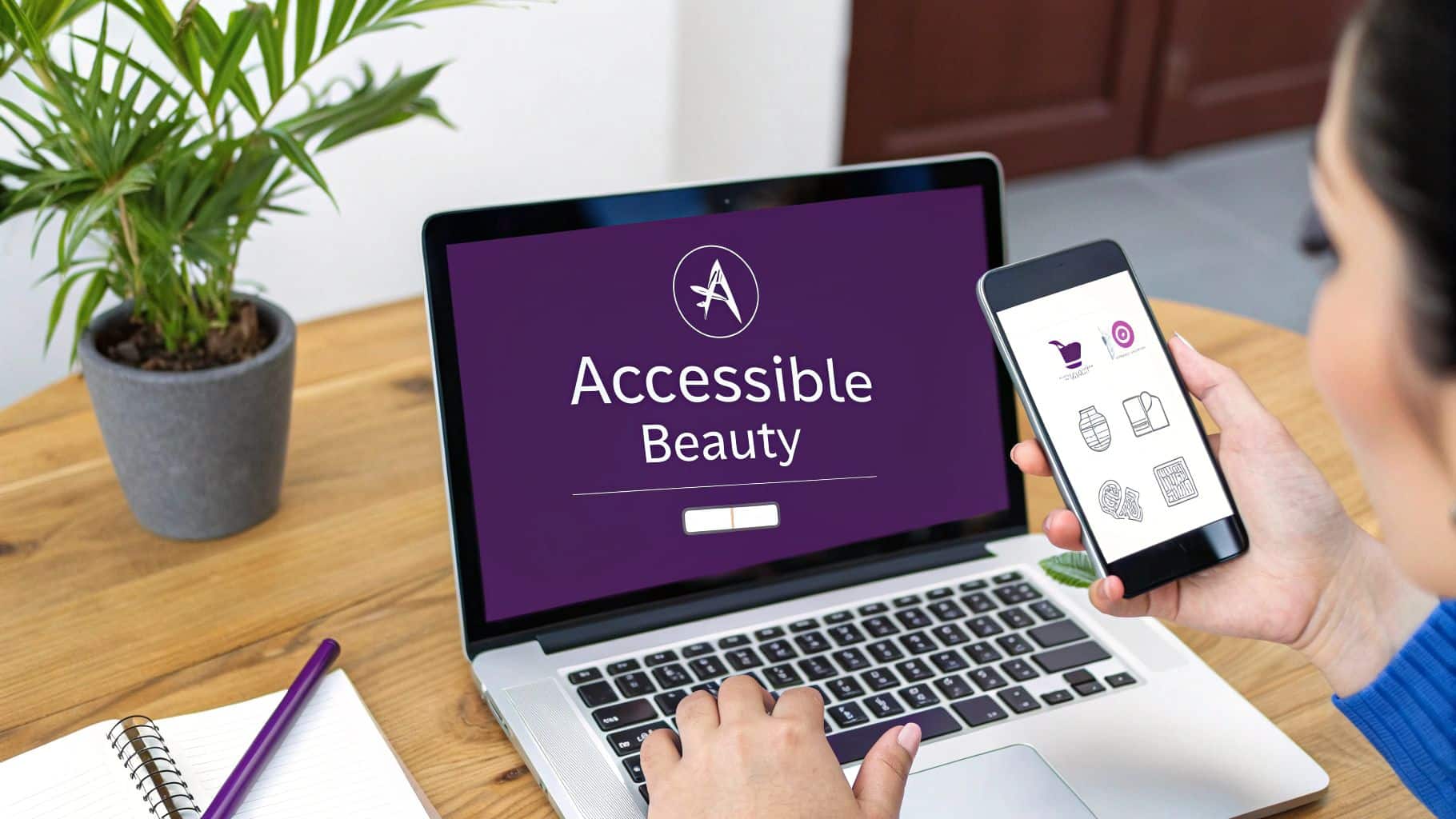
Beauty Site UX: Your Guide to Website Accessibility Best Practices
In the visually-driven beauty industry, it's easy to focus solely on aesthetics. A stunning website showcasing your services, from lash extensions to hairstyling, is essential. But what if that beautiful site is unusable for a significant portion of potential clients? A website that isn't accessible is like a salon with a locked front door-it inadvertently turns people away. This guide is designed to hand you the keys.
This article breaks down essential website accessibility best practices into 10 actionable steps, specifically tailored for beauty business owners. We will move beyond complex technical jargon and provide clear, easy-to-follow instructions that you or your web developer can implement immediately. By making your digital presence more inclusive, you not only comply with important standards but also enhance your brand's reputation and unlock new growth opportunities. To truly maximize your beauty business's reach and impact, an accessible website is key for clients looking to learn more about the field and available services, such as understanding medical aesthetics treatments.
We will cover critical topics ranging from semantic HTML and proper heading structure to ensuring your vibrant color palettes meet contrast requirements for readability. You will learn how to write effective alt text for your portfolio images, make your booking forms user-friendly for everyone, and ensure your site is navigable without a mouse. These practices ensure that every potential client, regardless of ability, can explore your services, find your location, and book an appointment with ease. Let's make your digital storefront as welcoming and inclusive as your physical one.
1. Follow the Web Content Accessibility Guidelines (WCAG 2.1)
Think of WCAG as the official rulebook for making your website accessible. Created by the World Wide Web Consortium (W3C), these guidelines provide a clear checklist for making your site usable for people with visual, auditory, physical, and cognitive disabilities. Following them is the first step to making your site truly welcoming.
The guidelines are built on four key ideas, remembered by the acronym POUR:
- Perceivable: Can users see and hear your content? This covers things like providing text alternatives for images.
- Operable: Can users navigate and use your site? This includes making sure your site works with a keyboard.
- Understandable: Is your content clear and easy to follow? This means using plain language and predictable layouts.
- Robust: Can your site be used by different technologies, like screen readers? This is about using clean code.
How to Get Started with WCAG
For your business, aim for WCAG 2.1 Level AA. This is the globally accepted standard that balances strong accessibility with practical implementation. It's the goal for most businesses and legal requirements.
Actionable Tip: Use a free tool like Google's Lighthouse (in the Chrome browser) to run a quick accessibility check on your site. It will give you an instant report and point out easy fixes, like missing image descriptions or low-contrast text.
Here are your first steps:
- Start with Easy Wins: Don't try to fix everything at once. Begin by adding descriptive alt text to your service photos and "before-and-after" images. Make sure your page titles and section headings are organized logically.
- Do a Keyboard Test: Can you book an appointment on your site using only the Tab key to move between fields and the Enter key to select? This simple manual check uncovers major navigation issues.
- Create an Accessibility Statement: Add a page to your website stating your commitment to accessibility. This builds trust and tells users you care. Include an email address for people to report any issues they encounter.
2. Use a Clear Heading Structure and Proper Code
The code behind your website acts like a map for assistive technologies like screen readers. Using the right HTML tags for your titles, paragraphs, and sections helps these tools understand your content. This is a core part of website accessibility best practices. A clean structure isn't just for developers—it creates a better experience for everyone.
Think of headings (H1, H2, H3) as an outline for your page. The main title of your page should be the H1. Major sections, like "Our Services" or "Meet the Team," should be H2s. Sub-sections within those, like "Lash Extensions" or "Manicures," would be H3s. For a screen reader user, this outline is essential. It lets them skip straight to the section they care about instead of having to listen to the whole page.
How to Create a Good Structure
Making your site's code logical is about choosing the right tag for the right job. This helps both search engines and assistive technology understand what your site is about, improving your SEO and user experience.
Actionable Tip: Look at your homepage. Is there only one main heading (H1)? Are your service sections introduced with subheadings (H2s)? If not, ask your web developer to correct the structure. It’s a simple fix with a big impact.
Here are your first steps:
- Check Your Headings: Use a browser extension like the "WAVE Web Accessibility Evaluation Tool" to see your heading structure. Ensure you have only one H1 per page and that you don't skip levels (like going from an H2 to an H4).
- Use the Right Page Sections: Your website's main menu should be in a
<nav>section, the primary content in a<main>section, and your contact info in a<footer>. Ask your developer to confirm these tags are being used. - Don't Use Headings for Style: It's tempting to use a heading just to make text bigger or bolder. Don't. Use headings to create a real outline. All visual styling should be handled separately with CSS.
3. Write Descriptions for Your Images (Alt Text)
Your beauty business relies on visuals—from photos of your salon to stunning before-and-afters. Alt text (alternative text) is a short, written description of an image that screen readers announce to users with visual impairments. It's a critical website accessibility best practice that ensures no one misses out on the beautiful work you do.
The goal of alt text is to explain the "why" of an image. If a client can't see the photo of a new balayage treatment, the alt text should describe the result for them. This practice not only helps users but also gives search engines more context about your images, which can improve your SEO.
How to Write Good Alt Text
Effective alt text is concise but descriptive. It should provide the same information as the image itself. For a gallery of your nail art, good alt text can be the difference between a client understanding your skills and leaving your site confused.
Actionable Tip: When writing alt text, be specific. Instead of just "new hairstyle," write "Client with shoulder-length brunette hair styled in loose curls after a balayage treatment." This paints a clear picture.
Here are your first steps:
- Be Descriptive, Not Redundant: Screen readers already announce that it's an "image," so you don't need to write "Image of…" or "Picture of…". Just describe what's in the photo.
- Define Image Purpose: If an image is also a link (like an icon that leads to your booking page), the alt text should describe the action, such as
alt="Book your appointment". For purely decorative images that add no information, leave the alt text blank (alt="") so screen readers will ignore them. - Audit Your Key Images: Go through your website's main pages, especially your services and portfolio. Does every important image have helpful alt text? Most website platforms (like WordPress or Shopify) have a simple field for this in the media library. Learn more about how you can optimize your images for the web to improve both accessibility and site performance.
4. Ensure Your Site Works with a Keyboard
Many people can't use a mouse due to motor disabilities or visual impairments and rely on a keyboard to navigate websites. Making sure every link, button, and form on your site is accessible using only a keyboard is a non-negotiable website accessibility best practice.
Two things are key for keyboard navigation:
- Logical Order: As a user hits the
Tabkey, the selection should move through your site's links and buttons in a predictable order, usually from top to bottom, left to right. - Visible Focus: It must be obvious which element is currently selected. This is usually shown with a visible outline or border around the button or link.
How to Make Your Site Keyboard-Friendly
A client should be able to browse your services, read reviews, and book an appointment without ever touching a mouse. This test is a great way to check how accessible your site truly is.
Actionable Tip: Never let your web designer use code that removes the focus outline (e.g.,
outline: none;in CSS) without providing a clear, visible replacement. This outline is the only way keyboard users know where they are on the page.
Follow these steps to improve keyboard access:
- Do the "Tab Test": Open your website and put your mouse away. Press the
Tabkey to move forward andShift+Tabto go back. Can you get to every interactive element? Is the order logical? Do you always see a visible outline so you know where you are? - Use Proper Buttons and Links: Ensure all clickable elements are created with the correct HTML, like
<button>or<a>tags. If you use other elements (like a<div>) as a button, they won't be accessible by keyboard by default. - Test Interactive Widgets: Check things like drop-down menus, image carousels, and pop-ups. Can you open and operate them with keys like
Enter,Space, and the arrow keys?
5. Use Colors with Enough Contrast
Your brand's colors are important, but if there isn't enough contrast between your text and its background, some users won't be able to read it. This is especially true for people with low vision or color blindness. Ensuring good color contrast is a simple but vital website accessibility best practice.
WCAG sets clear standards for this, measured as a ratio:
- Normal text: Must have a contrast ratio of at least 4.5:1.
- Large text (18pt/24px or 14pt/19px bold): Must have a ratio of at least 3:1.
- Buttons and icons: Should have a contrast of at least 3:1 against the background.
How to Check and Fix Color Contrast
That beautiful light-gray text on a white background might match your salon's aesthetic, but it could be unreadable for many potential clients. The good news is that this is easy to test and fix.
Actionable Tip: Use the free WebAIM Contrast Checker tool. Just enter the color codes for your text and background, and it will tell you instantly if you pass the test. Check your brand's main color combinations before you approve a new design.
Here are your first steps:
- Check Your Buttons and Links: It's not just your main text. Make sure the text on your "Book Now" button has enough contrast. Also, check what happens when you hover over a link—the color should still be compliant.
- Don't Rely on Color Alone: Never use color as the only way to convey information. For example, if you have a booking calendar, don't just use red to show a booked slot. Add an icon or text so the meaning is clear without color.
- Test for Color Blindness: Use a browser extension to simulate how your website looks to people with different types of color blindness. This will quickly show you where important information might be lost.
6. Use ARIA Labels for Custom Elements
While standard HTML is usually enough, sometimes your website may have custom interactive elements, like a unique booking calendar or a fancy image slider. ARIA (Accessible Rich Internet Applications) is a set of extra attributes you can add to your code to help screen readers understand these custom components.
Think of ARIA as a way to add helpful labels for assistive technology. For example, if you have a button that is just an "X" icon to close a pop-up, a screen reader might not know what it does. ARIA lets you add a hidden label that says "Close," making its function clear.
How to Use ARIA Correctly
The first rule of ARIA is to only use it when you have to. If a standard HTML element like <button> or <nav> exists, always use that first. ARIA is for situations where basic HTML isn't descriptive enough.
Actionable Tip: Look for icons on your site that don't have text labels, like a magnifying glass for search or a hamburger menu icon. Ask your developer to add an
aria-labelto them, such asaria-label="Search"oraria-label="Open navigation menu".
Here are your first steps:
- Label Key Page Sections: Ask your developer to use ARIA landmark roles (or the equivalent HTML5 tags like
<nav>,<main>,<footer>) to define the main sections of your pages. This acts like a table of contents for screen reader users, letting them jump directly to your main content or navigation. - Describe Custom Buttons: If you have any interactive elements without visible text, use an
aria-labelto give them an accessible name. This is crucial for icon-only buttons. - Be Careful with Implementation: Incorrect ARIA can make your site less accessible than no ARIA at all. This is a task best left to a developer who understands accessibility. Ask them to validate their work with tools like Axe DevTools to ensure it's implemented correctly.
7. Make Your Forms Easy to Use
Your booking and contact forms are where visitors become clients. If these forms are confusing or difficult to use, you'll lose business. An accessible form has clearly labeled fields, simple instructions, and helpful error messages. This is one of the most important website accessibility best practices because it directly impacts your bottom line.
When a form is accessible, screen readers can announce each field's label correctly, users can navigate between fields with a keyboard, and everyone can understand and fix errors easily. A frustrating form experience is a fast way to lose a potential client.
How to Build Accessible Forms
The goal is to create a process so smooth that anyone can book an appointment or send an inquiry without any trouble.
Actionable Tip: Fill out every form on your site using only the keyboard. Can you move between fields with the
Tabkey? Can you select options from a drop-down menu with the arrow keys and submit the form withEnter? This simple test will quickly show you where the problems are.
Follow these steps to improve your forms:
- Label Every Field Clearly: Make sure every input field (like "Name" or "Email") has a visible label that is programmatically connected to it. Ask your developer to check that each
<label>is correctly linked to its<input>. - Provide Helpful Error Messages: When a user makes a mistake, show a clear, friendly message right next to the field with the error. Instead of a generic "Error," say "Please enter a valid phone number." This helps users fix the problem quickly.
- Mark Required Fields: Don't just use a red asterisk (*) to show that a field is required, as screen readers may not announce it and color alone isn't enough. Add the word "(Required)" to the label itself for maximum clarity. Learn more about crafting the perfect contact page on gohappybeauty.com.
8. Provide Captions and Transcripts for Videos
Videos are a fantastic way to show off your salon, feature client testimonials, or share tutorials. But without captions, this content is useless for anyone who is deaf or hard of hearing. Providing captions and a text transcript is a key website accessibility best practice that makes your video content available to everyone.
Here's the difference:
- Captions are timed text that appears on the screen as the video plays. They should include spoken words and important sounds, like [music playing] or [client laughing].
- Transcripts are a separate text file of all the audio in the video. They are great for people who prefer to read the content and can also help your SEO because search engines can read the text.
How to Add Captions and Transcripts
While platforms like YouTube offer auto-captioning, they are often filled with errors. For a professional look, you should always review and edit them for accuracy.
Actionable Tip: For your most important videos, consider a professional captioning service like Rev. For a small fee, they provide highly accurate captions and transcripts, which saves you time and ensures your brand looks polished and professional.
Follow these steps to make your media accessible:
- Edit Auto-Generated Captions: If you use a free tool, always watch the video and edit the captions. Correct any spelling errors, especially for brand names or technical beauty terms, and add proper punctuation.
- Describe Important Sounds: Good captions include more than just speech. Add descriptions of sounds that add context, like [upbeat music] or [phone rings].
- Post a Full Transcript: Below your video player, include a link to or simply paste the full text transcript. This is incredibly helpful for many users and makes your content searchable.
- Use a Standard Format: When you upload your caption file to YouTube or Vimeo, make sure it's in a standard format like .vtt or .srt.
9. Ensure Your Site Works Well on Mobile Phones
These days, clients are more likely to browse your services and book appointments on their phones than on a desktop computer. A responsive website automatically adjusts to fit any screen size, providing a great experience everywhere. This is a fundamental website accessibility best practice in our mobile-first world.
A responsive site means no more pinching and zooming to read text or struggling to tap a tiny button. It ensures your content is legible and your booking form is easy to use, whether on a small smartphone or a large monitor. It also ensures the site works well with mobile screen readers like VoiceOver (on iPhone) and TalkBack (on Android).
How to Improve Your Mobile Experience
If your site is clunky on a phone, you're losing customers. A good mobile experience allows a client to go from your Instagram page to your booking page seamlessly.
Actionable Tip: Think "mobile-first." When designing a new page or feature, start by figuring out how it will work on a small screen. Make sure your most important buttons, like "Book Now" or "Call Us," are easy to find and tap.
Here are your first steps:
- Make Buttons Big Enough to Tap: All buttons, links, and form fields should have a touch target of at least 44×44 pixels. This prevents users from accidentally tapping the wrong thing.
- Test on Real Phones: Browser tools can simulate a mobile device, but it's not the same as using a real phone. Grab your smartphone and go through your entire website. Can you easily find information and complete a booking?
- Try Your Mobile Screen Reader: Turn on your phone's built-in screen reader (VoiceOver or TalkBack) and try to navigate your site. This will quickly reveal if your content is presented in a logical order and if your buttons are labeled correctly. To learn more, check out what mobile responsive design is and why it matters.
10. Declare the Language of Your Website
This is a simple but important technical step. You need to tell browsers and screen readers what language your website is written in. This allows screen readers to pronounce the words correctly. Without this, a screen reader might try to read an English site with a French accent, making it impossible to understand.
This small piece of code makes your content Understandable, which is a core principle of accessibility. For a beauty business that might use international terms for services (like balayage), getting the pronunciation right is key to clear communication.
How to Set Your Site's Language
This is a quick fix that your web developer can implement in minutes. It involves adding a "lang" attribute to your website's code.
Actionable Tip: If you use foreign words on your site, like the French term "balayage," ask your developer to wrap that specific word in a special tag that identifies it as French (e.g.,
<span lang="fr">balayage</span>). This tells a screen reader to switch to a French pronunciation just for that word, so it sounds correct.
Follow these steps for implementation:
- Set the Main Language: The most important step is to declare your site's primary language in the main
<html>tag at the very top of your code. For an English site, it should be<html lang="en">. This one line sets the language for the entire site. - Use Proper Language Codes: Ensure you're using standard codes. For example,
enfor English,esfor Spanish, orfrfor French. - Identify Language Changes in Text: If you mix languages, like a "¡Hola!" on your English contact page, wrap the Spanish word in a tag with its own language attribute:
<span lang="es">¡Hola!</span>. - Check for Right-to-Left Languages: If you ever use languages like Arabic or Hebrew that read from right to left, make sure the
dir="rtl"attribute is also added to ensure the text displays correctly.
10-Point Website Accessibility Comparison
| Item | Implementation Complexity 🔄 | Resource Requirements ⚡ | Expected Outcomes ⭐ | Ideal Use Cases 📊 | Key Advantages | Quick Tip 💡 |
|---|---|---|---|---|---|---|
| WCAG 2.1 Compliance (Web Content Accessibility Guidelines) | 🔄🔄🔄 High — comprehensive audits, policy & remediation | ⚡⚡⚡ High — tooling, training, legal resources | ⭐⭐⭐⭐⭐ Legal compliance, broad accessibility | Public sector, enterprise, legally regulated sites | International standard; clear success criteria; legally recognized | Start with AA; use Axe/Lighthouse; involve users with disabilities |
| Semantic HTML & Proper Heading Structure | 🔄 Low–Med — coding discipline and reviews | ⚡ Low — minimal tooling, developer time | ⭐⭐⭐⭐ Improves assistive tech interpretation & SEO | Content sites, news, documentation, any web pages | Better screen reader compatibility; SEO; maintainability | Use one H1 per page; avoid skipping heading levels |
| Alt Text & Image Descriptions | 🔄 Low–Med — content creation workflow | ⚡⚡ Medium — editorial time, possible tooling | ⭐⭐⭐⭐ Essential image comprehension; SEO benefits | E‑commerce, editorial, image-heavy sites | Enables screen readers; improves discoverability | Keep concise; use alt="" for purely decorative images |
| Keyboard Navigation & Focus Management | 🔄🔄 Medium — interaction patterns & manual testing | ⚡⚡ Medium — dev effort and manual QA | ⭐⭐⭐⭐ Improves usability for keyboard users & motor-impaired | Web apps, interactive UIs, complex controls | Enables keyboard-only access; boosts UX | Never remove focus rings; test with Tab/Shift+Tab |
| Color Contrast & Visual Distinctions | 🔄 Low — design changes and validation | ⚡ Low–Med — design updates, testing tools | ⭐⭐⭐⭐ Better readability and legibility | Text-heavy sites, branding-focused interfaces | Improves readability for many users; easy to audit | Use contrast checkers; don't rely on color alone |
| ARIA Labels & Landmarks (when HTML insufficient) | 🔄🔄🔄 High — technical and nuanced implementation | ⚡⚡⚡ Medium–High — specialist dev knowledge & QA | ⭐⭐⭐ Useful when native HTML isn't enough | Custom widgets, dynamic or rich internet apps | Makes custom components accessible if used correctly | Prefer native HTML first; test ARIA with real screen readers |
| Accessible Forms & Clear Error Handling | 🔄🔄🔄 Med–High — markup, validation & UX work | ⚡⚡ Medium — dev, QA, copywriting | ⭐⭐⭐⭐ Reduces abandonment; improves data quality | Checkout, registration, government forms | Clear labels, programmatic errors, better conversion | Link errors with aria-describedby; provide inline messages |
| Captions & Transcripts for Audio/Video | 🔄🔄 Medium — production workflow integration | ⚡⚡⚡ High — captioning/transcription costs & review | ⭐⭐⭐⭐⭐ Essential for deaf/hard-of-hearing users; SEO lift | Video platforms, training, podcasts, media publishers | Ensures access to audio; searchable transcripts | Use professional captioning; review auto-captions thoroughly |
| Responsive Design & Mobile Accessibility | 🔄🔄 Medium — adaptive layouts & touch patterns | ⚡⚡ Medium — device testing & performance tuning | ⭐⭐⭐⭐ Broader reach and mobile usability | Mobile-first sites, consumer-facing services | Single codebase; improved mobile UX and SEO | Design mobile‑first; ensure 44×44px touch targets |
| Page Language & Language Change Declarations | 🔄 Low — add lang/dir attributes correctly | ⚡ Low — minimal dev effort | ⭐⭐⭐⭐ Improves screen reader pronunciation & SEO | Multilingual sites, international content | Simple fix with strong impact on pronunciation | Set html lang='en' (or appropriate); wrap inline language changes with lang attribute |
Building a More Beautifully Inclusive Web
Navigating the world of digital accessibility can feel like learning a new language, but as we've explored, the core principles are rooted in a simple, powerful idea: making your online space as welcoming and functional as your physical salon. Embracing these website accessibility best practices is not just about ticking boxes on a compliance checklist; it's a strategic business decision that reflects your brand's commitment to inclusivity, care, and a superior client experience for everyone.
Throughout this guide, we've broken down ten essential pillars of an accessible website, from the foundational structure of semantic HTML to the nuanced details of ARIA labels and clear form error handling. Each practice serves a distinct purpose, yet they all work together to create a seamless, barrier-free journey for all visitors, including those who rely on assistive technologies.
From Technical Tasks to Brand Excellence
Making these changes elevates your brand beyond aesthetics. Implementing proper alt text for your stunning portfolio images ensures that users with visual impairments can appreciate your artistry. Ensuring high color contrast on your booking page means clients with low vision can easily schedule their next appointment without frustration. And by prioritizing keyboard navigation, you empower individuals with motor disabilities to explore your services and pricing just as effortlessly as any other potential client.
This commitment sends a clear message: every client is valued here. It’s a powerful differentiator in a competitive market, fostering loyalty and expanding your reach to the one in four adults in the U.S. who live with a disability.
Your Actionable Path Forward
The journey toward full accessibility is an ongoing process, not a one-time fix. Don't feel overwhelmed by the need to implement everything at once. Instead, adopt an iterative approach.
Here are your next steps:
- Start with an Audit: Use a free tool like WAVE or Lighthouse to get an initial snapshot of your site's accessibility health. This will help you prioritize the most critical issues.
- Tackle the Low-Hanging Fruit: Begin with the basics. Can you easily add alt text to your most important images? Can you adjust the colors on your primary call-to-action buttons to meet contrast requirements? These small wins build momentum.
- Integrate Accessibility into Your Workflow: Make accessibility a standard part of your process, not an afterthought. When you upload a new video, create captions and a transcript simultaneously. When you add a new page, check your heading structure from the start.
Ultimately, building a more inclusive web also involves careful organizational strategies. For instance, implementing effective digital asset management best practices ensures that your entire team uses correctly tagged and described images, videos, and documents, reinforcing accessibility at every level of your content creation. By embedding these principles into your daily operations, you create a sustainable foundation for a truly inclusive digital presence that grows with your business.
Remember, every single improvement you make contributes to a more equitable and beautiful web. You are not just optimizing code; you are opening your digital doors wider, inviting in a larger community, and proving that your brand’s dedication to beauty and wellness is for everyone.
Feeling overwhelmed with implementing these technical details on your own? The gohappybeauty platform is designed specifically for beauty professionals, with accessibility built into its core. We handle the technical complexities so you can focus on what you do best, ensuring your online presence is as welcoming and beautiful as your services. Build your inclusive, stunning website with gohappybeauty today.
Grow your beauty business
Our focus is, and always will be, helping you improve your online presence and generate more business from your website. That is what we do, for you.