 Grant Kantsios
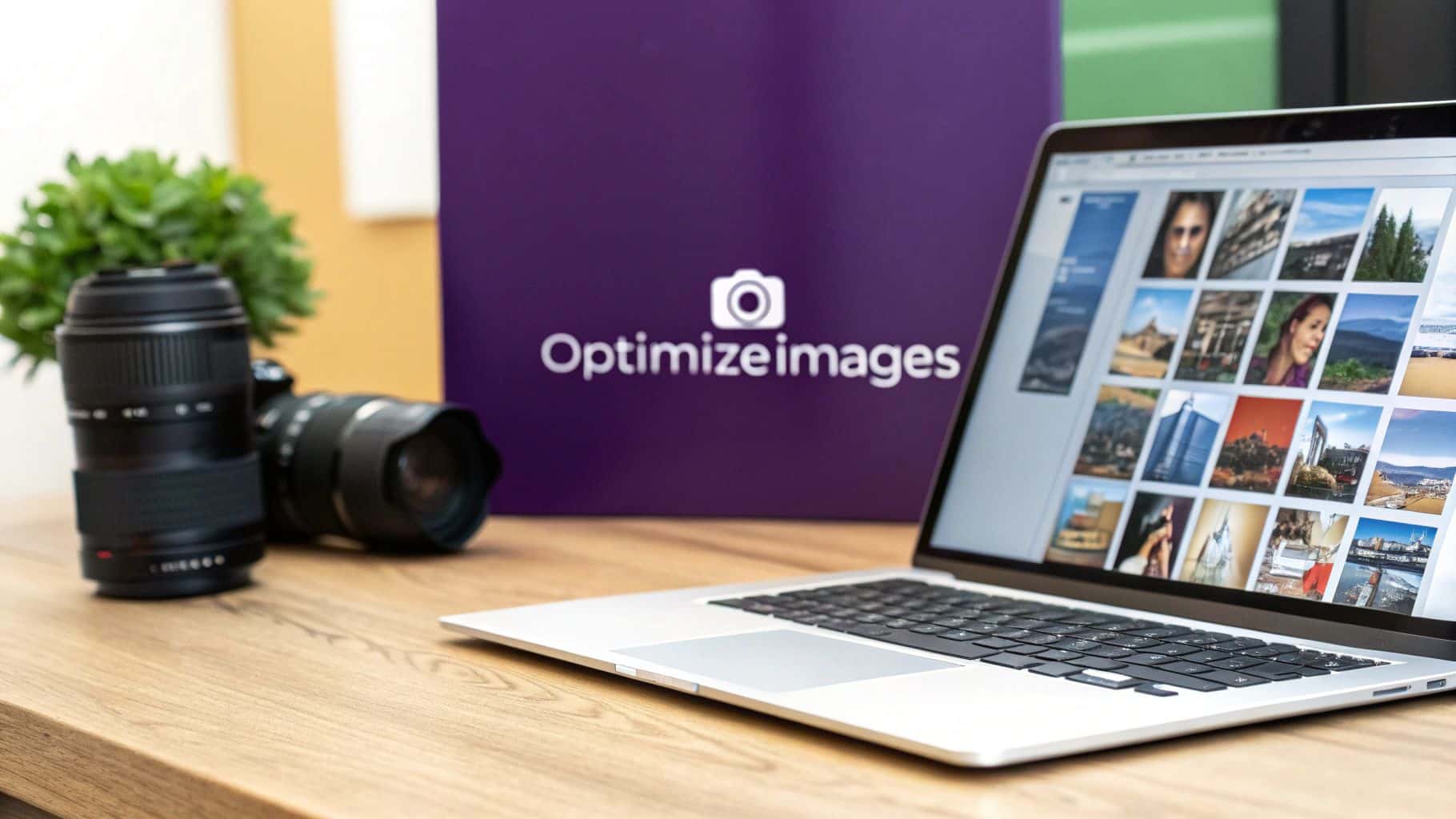
Optimizing your images is a simple, behind-the-scenes task that makes a massive difference to your website's performance. The goal is to shrink the image file size without turning your beautiful photos into a pixelated mess. When done right, this single step leads to faster page loading, a happier user experience, and a nice boost in your SEO rankings. It’s a mix of choosing the right format, compressing the file, and resizing the dimensions to get your website running smoothly.
Why Image Optimization Matters for Your Business

Have you ever run a Google PageSpeed Insights report and felt your stomach drop? That score is a direct reflection of how quickly a real person can actually use your site, and nine times out of ten, large, unoptimized images are the main culprit dragging everything down.
This isn't just a technical detail to ignore; it has a real-world impact on your bottom line. When a potential client lands on your website, every extra second they spend waiting for your portfolio to load is a second they're rethinking their decision to contact you.
The True Cost of Slow Images
Large, unoptimized images are one of the heaviest things a website has to load, and that delay is a visitor’s number one enemy. It’s frustrating, and it actively drives people away. In fact, studies show that slow-loading images are enough to make 39% of users abandon a website entirely.
If you want to go deeper into the technical side of things, this is a great guide on strategies to improve website loading speed.
The financial impact is staggering. Retailers lose an estimated $2.6 billion in sales every single year because of slow websites, and a huge chunk of that is due to bulky images.
Actionable Insight: Think of each unoptimized image as a roadblock between you and a paying customer. A few roadblocks are annoying but manageable. Too many, and visitors will just turn around and find an easier route—straight to your competitor.
SEO and User Experience
Search engines like Google are obsessed with user experience, and a huge part of that is speed. Page speed is a confirmed ranking factor, which means a slow site will hurt your search rankings. When you learn how to properly optimize images for the web, you're not just making your site faster; you're sending positive signals to Google.
Here’s how optimizing your images helps your business grow:
- Lower Bounce Rates: A fast site keeps people clicking around. They'll explore your services instead of hitting the "back" button in frustration.
- Improved Search Rankings: Google rewards fast, efficient sites with better visibility, making it easier for new clients to find you.
- Higher Conversion Rates: A smooth, quick experience builds trust and makes visitors feel confident enough to book an appointment or buy a product.
At the end of the day, spending a little time optimizing your images is one of the most effective things you can do to keep customers happy and grow your business.
Choosing the Right Image Format for the Job
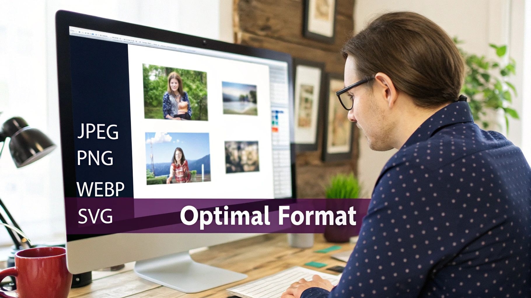
Before you start compressing or resizing, your first and most important step is picking the right image format. Getting this right from the start will save you a massive headache later on.
Think of it like this: your beautiful, full-color hero image has different needs than your crisp, clean business logo. Each one needs a specific format to look its best without slowing down your site. Understanding the strengths of each format is the key to a fast, visually stunning website.
Your Go-To Image Formats
For most business owners, you only need to understand a few key formats. Mastering these will cover 99% of your needs.
Here’s a simple breakdown of the most common types:
- JPEG (or JPG): This is your best choice for all complex photographs. Think client before-and-after shots, photos of your business interior, or vibrant product pictures. JPEGs handle millions of colors and offer fantastic compression, making them perfect for any detailed, real-world image.
- PNG: Use a PNG anytime you need a transparent background. Your logo, icons, or any graphic that needs to sit cleanly on a colored section of your site should be a PNG. They keep edges sharp, but the trade-off is often a larger file size than a JPEG.
- SVG: For logos and simple icons, SVG is the best option. Because they are vector-based (made of code, not pixels), they can be scaled to any size without losing quality. Your logo will look perfectly sharp on any screen, and the file size will be incredibly small.
- WebP: This is the modern, high-performance option. WebP offers the best of both worlds, providing excellent quality with significantly smaller file sizes than both JPEGs and PNGs. It supports transparency and complex colors, making it a fantastic all-around choice.
Actionable Insight: Match the format to the image's purpose. Use JPEGs for photos, PNGs for graphics needing transparency, and SVGs for logos. When in doubt, WebP is almost always the best-performing choice for any image on your website.
To make this even simpler, use this quick-reference table. Bookmark this page or screenshot it—it's a lifesaver when you're updating your website.
Image Format Quick Guide: When to Use Each Type
| Format | Best For | Key Feature | Transparency Support |
|---|---|---|---|
| JPEG | Photographs, complex images with gradients | Handles millions of colors with great compression | No |
| PNG | Logos, icons, graphics with sharp lines | "Lossless" quality, maintains crisp edges | Yes |
| WebP | All-purpose photos and graphics | Superior compression for smaller file sizes | Yes |
| SVG | Logos, simple icons, line art | Vector-based, scales perfectly to any size | Yes |
Ultimately, knowing when to use each format is a core skill for managing a website. It’s a small choice that has a huge impact on how fast your pages load for potential clients.
Making the Modern Choice with WebP
As web technology evolves, so do our tools. Using next-gen formats like WebP is now standard practice for balancing quality and speed. On average, WebP files are 25-34% smaller than JPEGs and 26% smaller than PNGs without any noticeable drop in quality. That's a massive performance boost.
For a really deep dive into the technical side of things, check out this guide on choosing the best image format for web performance.
Adopting modern formats is one of the easiest yet most powerful steps you can take. This one small decision lays the foundation for a faster website that keeps potential clients engaged.
Compressing Images Without Sacrificing Quality
You've picked the perfect format. Now comes the part where the real magic happens for your site speed: compression. This step shrinks your image file sizes so they load in a snap for your visitors.
The goal is to make the file smaller without turning your gorgeous photos into a blurry, pixelated mess. Don't worry, you don't need to be a graphic designer to do this. Modern tools make it simple for anyone to get professional results.
Lossy vs. Lossless: What You Need to Know
Before you start, it helps to understand the two main types of compression. They sound technical, but the idea is simple.
- Lossless Compression: Think of this as tidying up. This method shrinks the file by removing extra, non-essential data. Not a single pixel is changed, so the quality stays 100% identical to the original. The downside? The file size reduction is usually pretty small.
- Lossy Compression: This is where you get the biggest speed improvements. It smartly removes tiny bits of visual information that the human eye isn't likely to notice. The result is a much smaller file. When done right, the difference in quality is practically invisible.
For making your website faster, lossy compression is your best friend. It gives you the biggest impact on speed, and you have control over the final quality.
This infographic breaks down the workflow perfectly, helping you balance the right tools with the right settings.
As you can see, it's a simple, three-step process: choose your tool, upload your image, and adjust the settings. Nail this, and you'll have an efficient optimization process you can use every time.
Easy-to-Use Tools for Image Compression
You don't need expensive software like Photoshop. There are several free, web-based tools that are incredibly powerful and easy to use.
Here are my top recommendations for business owners:
- Squoosh: This tool from Google is fantastic because it gives you a live, side-by-side preview. You can drag a slider to adjust the compression and instantly see how it affects the image quality and the final file size.
- TinyPNG: Don't let the name fool you—it works on JPEGs, too! TinyPNG is the definition of easy. Just drag and drop your images, and it automatically gives you a beautifully compressed version with a great balance of size and quality.
Actionable Insight: When using a tool like Squoosh, start by setting the quality slider to around 75%. For most photos, you'll be hard-pressed to spot the difference between 75% and 100%, but the file size can easily drop by over 50%.
Compressing your images is a huge piece of the puzzle. For more tips on getting your site in top shape, check out these website performance optimization tips that cover everything from loading speed to user experience.
Serving Responsive Images for Mobile Users
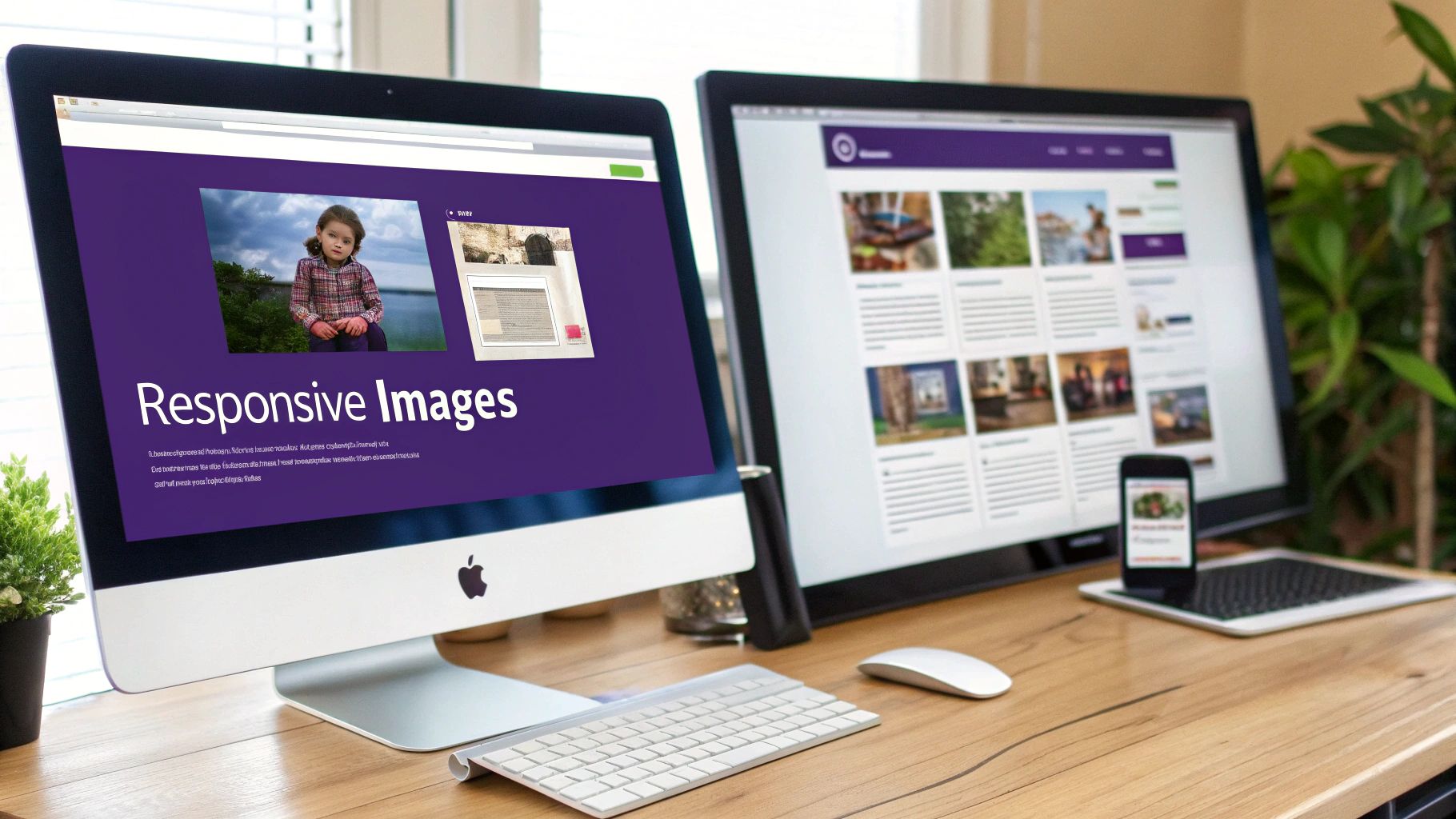
Let's face it: a huge portion of your customers are visiting your site on their phones. Their mobile experience is everything. That’s why serving properly sized images to smaller screens isn’t just a good idea—it’s essential.
Forcing a tiny smartphone to download a gigantic desktop image creates a slow, clunky experience that sends potential clients away. The solution is to use responsive images, a clever technique where a visitor's browser chooses the perfect sized image for its screen.
The Magic of the srcset Attribute
This is where a bit of code called the srcset attribute comes into play. It sounds technical, but the concept is simple. Instead of giving a browser just one image, srcset provides a menu of different image sizes.
Your website's code lists multiple versions of the same photo, each with a different width, for example:
salon-hero-small.jpg(for phones)salon-hero-medium.jpg(for tablets)salon-hero-large.jpg(for desktops)
The browser automatically detects the user's screen size and downloads only the file it needs. This means your mobile visitors get a small, fast-loading image, while desktop users see the full-quality version. It's a win-win that makes your site feel fast for everyone. To see how this fits into the bigger picture, check out our guide on what is mobile responsive design.
By serving different image sizes based on the device, you directly improve page load times for the majority of your visitors. This small adjustment is one of the most impactful ways to enhance the mobile user experience.
Why This Is a Big Deal for Your Business
Implementing responsive images is standard practice for any successful website. In fact, about 90% of websites now use responsive design, showing just how crucial it is.
Even more telling, 62% of top-ranking websites prioritize mobile optimization, which means smart image handling plays a massive role in search rankings. You can dig into more web design stats about the state of modern websites at Hostinger.com.
The good news? Most modern website builders, like WordPress and Shopify, handle this for you automatically. When you upload an image, they create the different sizes and add the srcset code without you having to do a thing. It’s worth checking your platform's settings to make sure this feature is enabled—it’s a powerful and effortless way to boost your site’s performance.
How Images Can Boost Your SEO
The images on your website do more than just make it look pretty—they're a secret weapon for getting found on Google. Every photo is a chance to tell search engines what your content is about, which can help new clients discover you through Google Image Search.
It all comes down to two simple things you can control: your image file names and alt text. Since search engines can't "see" pictures, they rely on these text clues to understand your visuals.
Step 1: Name Your Files Before You Upload
Before you upload an image, take a moment to look at its file name. If it says IMG_8475.jpg, you're missing a huge SEO opportunity. A descriptive, keyword-rich file name gives Google instant context.
Let's say you're an esthetician in Austin showing off a new hydrafacial service.
- Bad:
photo1.jpg - Good:
hydrafacial-service-austin-tx.jpg - Great:
glowing-skin-after-hydrafacial-austin-spa.jpg
See the difference? This simple habit helps your images appear in search results when potential clients are looking for exactly what you offer.
Actionable Insight: Think of your image file name as the first piece of SEO information you give a search engine. Make it count by being descriptive and using relevant keywords.
Step 2: Write Alt Text That Helps Everyone
Alt text (or alternative text) is a short description you add to an image in your website's editor. Its main purpose is for accessibility—it's what screen readers announce to visually impaired users so they know what an image shows.
But it also pulls double duty for SEO. Google reads your alt text to understand an image's content, which helps you rank in both regular web and image searches.
Here’s a simple formula for writing great alt text:
- Describe what's in the image: Be clear and specific.
- Keep it concise: A short sentence is perfect.
- Include a keyword naturally: Add your target keyword where it makes sense.
For example, for a photo of a client's fresh eyelash extensions, your alt text could be: "Woman with long, full classic eyelash extensions from a lash artist in Miami." This is much more effective than just "lash extensions." Getting these on-page basics right is a game-changer; you can get the full scoop in our guide on what is search engine optimization.
Remember, a fast site is a huge ranking factor for Google and can lead to a 32% reduction in bounce rates when page load times drop from 3 seconds to just 1. It’s all connected. When you combine smart SEO practices with fast, optimized images, you create a powerful strategy that makes your site faster and more visible.
Answering Your Top Image Optimization Questions
Once you start optimizing images, a few common questions always come up. Here are the answers to help you perfect your process.
Think of this as your final checklist. Nailing these details ensures your entire image strategy is solid.
What is the ideal image file size?
While there's no single "magic number," a great rule of thumb is to keep your most important visuals—like a homepage hero image—under 150 KB. This keeps it looking sharp while still loading quickly.
For smaller images, like blog post thumbnails or product shots, aim for under 80 KB. The goal is to find the perfect balance between a small file size and crisp, professional quality. Don't compress an image so much that it looks blurry; just find the point where it looks great but doesn't weigh down the page.
Actionable Insight: The key isn’t hitting an exact number. It's about respecting your visitor's time. A smaller file means a faster website, which means happier people who are more likely to book an appointment.
Do I really need to resize images before uploading?
Yes, absolutely. This is a non-negotiable step. Always resize your images to the exact dimensions they will be displayed on your site before you upload them.
A common mistake is uploading a giant 4000-pixel photo and letting the website builder shrink it with code. This is a huge performance killer because the visitor's browser is still forced to download the massive original file first. The correct workflow is to resize the image to its final display size first, and then run it through a compression tool.
Can I fix images that are already on my website?
Yes, and it’s one of the best ways to give your site an instant speed boost. The method depends on your platform.
- For WordPress users: You're in luck. Plugins like Smush or ShortPixel are lifesavers. They can scan your entire media library and automatically optimize all of your old images in bulk.
- For other platforms: If you don't use a CMS with plugins, the process is more manual. You’ll have to download your images, run them through a tool like TinyPNG, and then re-upload them to replace the old, oversized files.
Tackling your past uploads is a project worth doing. You'll see a real difference in your site's speed, which improves both user experience and your SEO.
Ready to build a stunning, SEO-optimized website that brings in clients without the technical headaches? At gohappybeauty, we create websites specifically for beauty professionals that are not only beautiful but also built to rank. Discover how a gohappybeauty website can grow your business.


