
Your website's contact page is often the last stop a visitor makes before becoming a client. Let's be real—a great contact us website design isn't just a digital mailbox. It's a powerhouse conversion tool that seals the deal, convincing a potential customer that you're the right choice.
For beauty businesses, this is where the magic happens. It's where consultations get booked, questions get answered, and new client relationships begin.
Your Contact Page Is a Conversion Machine
Think of your contact page as the digital front desk of your salon or spa. It's not just a place for an email address; it’s a critical moment in the customer journey where someone decides if your brand is professional, trustworthy, and easy to work with.
A clunky, confusing, or uninspired page can make them second-guess their decision and click away forever. We’ve all been there.
On the other hand, a beautifully designed page does the exact opposite. It builds confidence and makes reaching out feel effortless and inviting. This is your chance to turn a curious browser into a paying client by giving them a seamless experience from start to finish.
First Impressions Are Everything
Visual appeal and user experience are essential for building trust from the very first click. The look and feel of your page can make or break a potential booking.
In fact, a whopping 94% of a potential customer's first impression of a website comes directly from its design. A poor experience will send visitors running before they even think about contacting you.
Actionable Tip: A great user experience, complete with clear and accessible contact methods, can seriously boost your conversion rates. This turns your contact page from a simple info hub into a primary engine for business growth.
Turning Clicks Into Clients
For any beauty business, every single inquiry is a potential long-term client. Your contact page has one job: capture those leads effectively. To do this, focus on these three things:
- Clarity: Is it immediately obvious how to get in touch? No hunting required.
- Simplicity: Is the contact form short, sweet, and easy to fill out?
- Accessibility: Does the page look and work perfectly on a phone?

When you start seeing your contact page as a strategic asset, you can make small tweaks that have a huge impact on your bottom line. We break it all down in our detailed guide on creating a high-impact contact page design. Shifting your perspective is the first step toward turning an often-overlooked page into your hardest-working sales tool.
Designing for Trust and Easy Navigation
When a potential client lands on your contact page, their patience is thin. They’re looking for a quick, straightforward way to get in touch, not a digital scavenger hunt. An intuitive and trustworthy user experience isn't just a nice-to-have; it’s the entire foundation of a great contact us website design.
Simple, clean layouts always win. They cut out the friction and get straight to the point. A visitor should instantly know where to look for your phone number, email, or contact form. Think about how the human eye naturally scans a page—key information needs to be "above the fold" so it’s visible without any scrolling.
Make Contact Effortless
Place your most important contact methods where they are absolutely impossible to miss. For a beauty business, this usually means a prominent phone number and a simple contact form right at the top of the page. Don't make people dig for the very reason they came to the page.
Your goal is to build confidence from the moment they arrive. Every second a user spends searching for info is another second they might decide to just click away.
Actionable Tip: Your contact page should assist, not frustrate. A user-centered design that prioritizes easy navigation is the most effective way to encourage potential clients to take that final step and reach out.
The data backs this up, showing that clean functionality trumps flashy aesthetics on pages like this. In fact, an overwhelming 94% of users consider easy navigation the most critical feature of a website. Poor functionality is a major reason visitors bounce, which really hammers home the need for a design that is both clear and genuinely helpful. You can dig deeper into how user preferences impact website success for more insights. This focus on pure usability has been a top priority for users for years.
Build Trust with Social Proof and Transparency
Beyond the basics, you can build a much stronger connection by adding in links that offer social proof. This is especially vital for personal service businesses like salons and spas, where trust is everything.
Here's how to weave these elements into your page to make it feel more complete and credible:
- Social Media Profiles: Add icons linking to your Instagram, Facebook, or Pinterest. This shows you have an active, engaged community and gives potential clients a peek at your work.
- Link to Your 'About Us' Page: Putting a face to the business name makes your brand feel more human and approachable. It's a small touch that goes a long way.
- Physical Address with Map: If you have a brick-and-mortar location, embed a Google Map. It adds legitimacy and makes it dead simple for clients to find you.
Crafting a Contact Form People Actually Use
Your contact form is the heart of your "Contact Us" page. It's also the spot where most potential clients get frustrated and bail. The whole point of solid contact us website design is to create a form that feels completely effortless, encouraging people to take that final step and reach out.
The golden rule? Simplicity. Every extra field you add creates friction and can tank your submission rates. Stick to the absolute must-haves for starting a conversation: a name, an email, and a message box. Seriously, that's it. Anything else can wait until you reply.
Make Every Field Count
For a beauty business, you can get smarter with your form without making it longer. Instead of a generic message box, think about adding a dropdown menu labeled "I'm interested in…" This one little change is a huge win for everyone.
- For the client: It makes it super easy for them to tell you what they need (e.g., "Balayage," "Lash Extensions," "Bridal Makeup"). No guesswork involved.
- For you: It instantly organizes your inquiries, telling you what the message is about before you even open it. Talk about a workflow dream.
This simple tweak helps you qualify leads on the spot and makes your follow-up feel way more personal, showing the client you’re already tuned into their needs.
Actionable Tip: The best contact forms feel less like a survey and more like the start of a helpful conversation. Guide users with clear labels, helpful placeholder text (like "Tell us about your hair goals!"), and a design that looks flawless on a phone.
When you're designing your form, it's easy to fall into common traps. This quick table breaks down what to do—and what to avoid—to keep your form user-friendly and effective.
Contact Form Field Analysis Do's and Don'ts
| Field Type | Best Practice (Do) | Common Mistake (Don't) |
|---|---|---|
| Name | Use a single "Full Name" field. It's faster and less intimidating. | Splitting it into "First Name" and "Last Name." It adds an unnecessary step. |
| Use a single, clearly labeled "Email" field. | Asking for email confirmation. This doubles the effort and suggests you don't trust them. | |
| Phone Number | Make it optional. Many people prefer email and a required phone number is a major turn-off. | Making the phone number a required field. You'll lose leads who are hesitant to share it. |
| Service Inquiry | Use a dropdown menu with your key services. It's organized and easy for the user. | Using a generic, open-ended "Subject" line that forces the user to think too much. |
| Message Box | Use placeholder text to prompt the user, e.g., "Tell me about your event date and vision!" | Leaving a totally blank box. It can feel intimidating and lead to vague messages. |
| CAPTCHA | Use invisible reCAPTCHA or a simple checkbox. Make it as seamless as possible. | Forcing users to solve complex puzzles or identify blurry images. It's a conversion killer. |
Ultimately, a well-designed form respects the user's time and makes it as easy as possible for them to get in touch.
The Final Click: Your Call-to-Action
Use action-oriented text that feels personal and direct. A button that says "Send My Message" or "Request a Consultation" is way more compelling because it connects the click to their goal. Make that button pop with a contrasting color so it’s impossible to miss.
This infographic breaks down the simple workflow for creating a high-impact contact form.
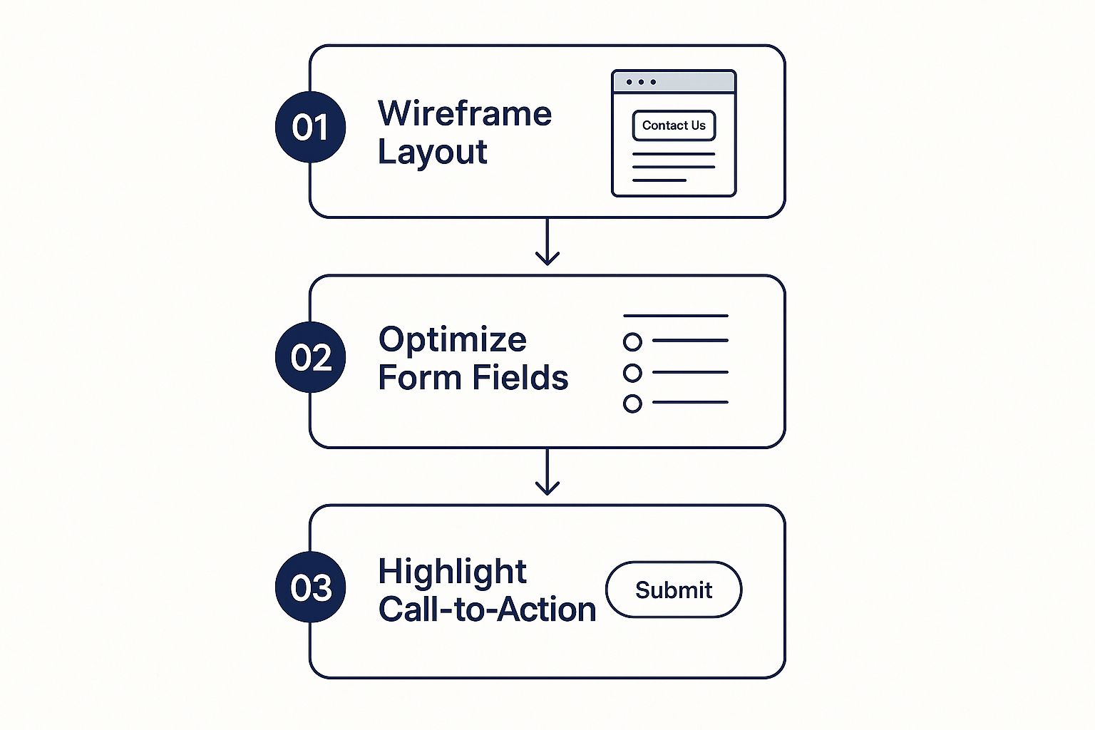
As you can see, focusing first on the layout, then optimizing the fields, and finally nailing the CTA creates a logical path that encourages more people to get in touch.
Offer More Than One Way to Connect
Relying on a single contact form is like only offering one shade of lipstick—it’s a huge missed opportunity. Your clients have different ways they like to communicate. Some want to pick up the phone for a quick chat, while others would rather shoot off an email or even slide into your DMs. A killer contact us website design meets them where they are.
When you give visitors multiple channels to reach out, you let them choose what feels easiest and most comfortable. This simple move makes them way more likely to actually get in touch. It's not just about being accommodating; it's about capturing every single lead that comes your way.
Clean Up Your Contact Options
Okay, so more options are better, but a cluttered page is a total conversion killer. You don't want to overwhelm visitors with a chaotic mess of numbers and links. The trick is to organize your contact details so people can instantly find what they need.
Here’s a simple way to segment your information to guide them to the right place.
- For Bookings & General Questions: Your main phone number and a simple contact form should be front and center. Actionable Step: Make sure your phone number is "click-to-call" so mobile users can simply tap to dial.
- For Press or Collaborations: Set up a dedicated email address, like
[email protected]. This keeps these important inquiries from getting lost in a sea of appointment requests. - For In-Person Visits: Embed a Google Map with your salon's address. It adds a layer of trust and makes you super easy to find.
- For a Peek at Your Work: Link out to your key social media profiles. For a beauty brand, Instagram and Pinterest are non-negotiable for showing off your portfolio.
Organizing your contact info like this doesn't just make for a better user experience; it makes your life easier, too. A client looking to book an appointment gets a direct path, while a potential brand partner knows exactly who to email.

The best brands get this. They know that offering varied, well-organized ways to connect is a direct line to better engagement. By creating different paths for different needs—like sales, support, or general questions—they make it ridiculously easy for visitors to get what they need, which dramatically increases the chance of turning a looker into a booker. This is a core principle of modern, user-focused design.
If you want to dive deeper, we have a whole guide on other conversion rate optimization best practices.
Make Your Page a Local SEO Magnet
A gorgeous contact page is great, but what's the point if local clients can't find it? This is where your contact us website design becomes a powerhouse for local search, guiding nearby customers straight to your salon or spa right when they’re ready to book. It's time to connect that beautiful design with the technical details that search engines crave.
Think about it. When someone types "lash extensions near me" into Google, you want your contact page popping up at the top. It all starts with making your location painfully obvious to search engines.
Put Your Salon on the Map (Literally)
Embedding a Google Map is a no-brainer for users, but its real magic is for SEO. It sends a huge signal to Google about your physical location, dramatically increasing your chances of showing up in the local map pack. Just make sure it's an interactive map, not just a static screenshot.
But a map isn't enough. You need to spoon-feed search engines your address in a language they can't misinterpret. This is done with local business schema markup—a little snippet of code that explicitly tells Google, "Hey, this is our address, this is our phone number, and these are our hours." It removes all the guesswork and builds trust.
Actionable Tip: Local SEO for your contact page isn't just a techy to-do list item. It's a direct line to your ideal, nearby clients. Optimizing for local search ensures you show up the exact moment a potential customer is looking for what you do.
Build Authority with Smart Linking
The URL of your page matters more than you might think. A clean, simple URL like yoursite.com/contact is way better for SEO than a long, clunky one. It’s easy for both people and search engine bots to read and understand.
Finally, you need to link to your contact page from key spots across your own site. Every single service page—like "Facials," "Manicures," or "Balayage"—should have a clear link pointing back to your contact page. Your website's footer is another non-negotiable spot for this link. This internal linking strategy tells search engines that your contact page is important, helping it rank higher.
If you want to dig deeper into your site's performance, check out these essential SEO tools for small businesses that can help you track your progress.

Answering Your Burning Questions
When you're fine-tuning your contact page, a few questions always seem to pop up. Nailing these details can be the difference between a visitor who clicks away and one who becomes your next loyal client. Let's tackle some of the most common sticking points.
Getting these right means you can sidestep the usual mistakes that might be costing you leads without you even realizing it.
How Many Fields Should My Contact Form Really Have?
Honestly? As few as humanly possible. Think lean. All you truly need to get the conversation started is a Name, Email, and a Message box. That’s it.
Every extra field you add is another little hurdle, another reason for someone to bounce. You can always ask for more details in your follow-up email once you've made that initial connection. It's not just a hunch, either—a well-known study showed that cutting form fields from just four down to three can boost conversions by a whopping 50%.
Should I Put My Phone Number on My Contact Page?
Yes, absolutely. Especially if you run a hands-on local business like a salon or spa. So many clients still prefer to just pick up the phone for a quick question or to book right then and there.
Putting your number on the page makes your business feel real and accessible. It builds a layer of trust that a simple form can't.
Actionable Step: Make sure your phone number is formatted as 'click-to-call.' For anyone browsing on their phone, this is a lifesaver. They can just tap the number to dial, removing one more annoying little step between them and booking an appointment with you.
What’s the Single Most Important Thing on a Contact Page?
If I had to pick just one, it’s your Call to Action (CTA). Hands down. Every other element on the page is there to lead your visitor to this one final step. Your CTA—whether it's "Send Message" or "Book a Consultation"—needs to be impossible to miss.
Make that button pop with a color that stands out from everything else on the page. Use punchy, action-focused text that tells people exactly what happens next. Without a clear, compelling CTA, visitors are left hanging, and your beautiful page just won't do its job.
How Do I Stop All the Spam from My Contact Form?
Ugh, form spam. It’s the worst. Thankfully, you don't have to put up with those clunky, annoying "I'm not a robot" puzzles anymore. The best solution out there is a modern tool like Google's reCAPTCHA v3. It works silently in the background to figure out who's human and who's a bot, so your real clients never have to solve a thing.
Another slick trick is the "honeypot" field. It's a hidden field that only spam bots can see. When a bot fills it out (which they love to do), the form submission is automatically flagged as spam and tossed out. You never even see it.
Ready to create a website that not only looks stunning but also brings in new clients on autopilot? At gohappybeauty, we build SEO-optimized websites specifically for beauty professionals like you. Get started with gohappybeauty today and turn your online presence into your most powerful booking tool.