High-Converting Contact Us Page Design

Your contact us page is more than a digital business card. For a beauty business, it’s the exact spot where a potential client decides to book that lash appointment, ask about your balayage services, or leave your site forever.
Why Your Contact Page Is a Conversion Goldmine
Many business owners treat their contact page like an afterthought. They just add an email address and a phone number to a blank page and call it a day. Honestly, that’s a huge missed opportunity.
Think of it this way: your contact page is the final step in a client's journey. It’s your digital front desk, and it needs to be just as welcoming and efficient as the real thing. A great contact page turns a curious visitor into a paying client.
Imagine a potential client lands on your site. They’re wowed by your portfolio of stunning updos or flawless brow work. They navigate to your contact page, ready to book, only to find a clunky, confusing form. They get annoyed and click away. Just like that, you’ve lost a client—probably to your competitor.
Shifting from Utility to Strategy
Now, picture this instead. The same client finds a page that not only gives them your details but also answers their burning questions right away. It offers multiple ways to connect: a simple form for quick inquiries, a direct link to your online booking system, and a click-to-call number for anyone who just wants to chat.
This isn’t just about looking professional; it’s about making it as easy as possible for people to give you their business.
Your website's design is your first impression. The data shows that 94% of potential customers form judgments about a company based on its website alone. On top of that, about 38% of visitors will abandon a site if the user experience is poor, turning that neglected contact page into a major leak in your sales funnel.
A great contact page doesn't just provide information; it removes friction. Every single element should be intentionally designed to guide the user toward a specific action, whether that's booking a service, scheduling a consultation, or simply asking a question.
Here's a quick breakdown of how specific elements on your contact page can either hurt or help your business goals.
Contact Us Page Elements Impact on Business Goals
| Element | Potential Negative Impact (Poor Design) | Potential Positive Impact (Good Design) |
|---|---|---|
| Contact Form | Confusing fields lead to form abandonment. Vague submissions create admin headaches. | Clear, simple fields capture qualified leads. Smart forms pre-qualify clients. |
| Booking Link | Hidden or broken links frustrate users and cause lost appointments. | A prominent, one-click booking button drives direct revenue. |
| Phone Number | Not clickable on mobile, forcing users to copy-paste. Leads to call abandonment. | A "click-to-call" number makes it effortless for mobile users to connect instantly. |
| Business Hours | Missing or incorrect hours cause confusion and no-shows for walk-ins. | Clearly listed hours set expectations and build trust. |
| Location/Map | No embedded map forces users to leave your site to find you, risking distraction. | An interactive map provides easy directions and boosts local SEO. |
| FAQ Section | Lack of an FAQ means you answer the same questions over and over via email. | A mini-FAQ answers common questions, saving you time and building client confidence. |
A well-designed page turns interest into action, while a poorly designed one is a dead end for your business.
The Real Cost of a Poor Contact Page
A sloppy contact page directly hits your bottom line. It creates unnecessary work for both you and your potential clients. Here’s how:
- Missed Opportunities: If someone can't figure out how to book within a few seconds, they're not going to try very hard. They’ll just find a competitor who makes it easier.
- Increased Admin Work: A vague form that just says "Message" leads to equally vague inquiries. You end up in a long back-and-forth email chain just to figure out what service they even want.
- Damaged Brand Perception: A hard-to-use page signals a lack of attention to detail—the very last impression a beauty pro wants to give.
To turn your contact page into a client-booking machine, you need to test what works. You can use the best conversion rate optimization tools to see how users interact with your page. Investing a little time here pays off big time by capturing better leads and turning them into loyal clients.
The Building Blocks of a Killer Contact Page
Every high-converting contact page is built from a few core elements that work together to turn a curious visitor into a booked client. Think of these as the non-negotiable ingredients for your business's digital front desk. Without them, even the most gorgeous website will fail to convert interest into actual appointments.
The goal is to create a seamless experience that feels welcoming and intuitive. A potential client should land on this page and know exactly what to do next without a second thought. That clarity is what separates a page that brings in business from one that just takes up space.
Start with a Welcoming Headline
Your headline is the first thing people see, so it needs to do more than just say "Contact Us." A great headline is an invitation. It should immediately set a positive tone and let the visitor know they’re in the right place.
Actionable Insight: Instead of a generic headline, try one with more personality that connects to your services:
- "Let's Create Your Dream Look"
- "Ready to Book Your Moment of Bliss?"
- "Get in Touch – We Can't Wait to Meet You"
This simple switch transforms the page from a cold, functional form into a warm, personal invitation.
Offer Multiple Ways to Connect
Everyone has their preferred way of communicating. A great contact page understands this and offers a few different options. This empowers your clients to connect in the way that feels most comfortable for them, which removes friction and makes them more likely to follow through.
Actionable Insight: At a minimum, your page should include a mix of these contact options:
- A Simple Contact Form: Perfect for non-urgent questions about services or pricing.
- A Click-to-Call Phone Number: An absolute must for mobile users who want to call and book an appointment immediately.
- A Direct Email Address: Great for media inquiries, brand collaborations, or more detailed questions that don't fit into a form.
- An Online Booking Link: This is your direct path to revenue. Make this button big, bold, and impossible to miss.
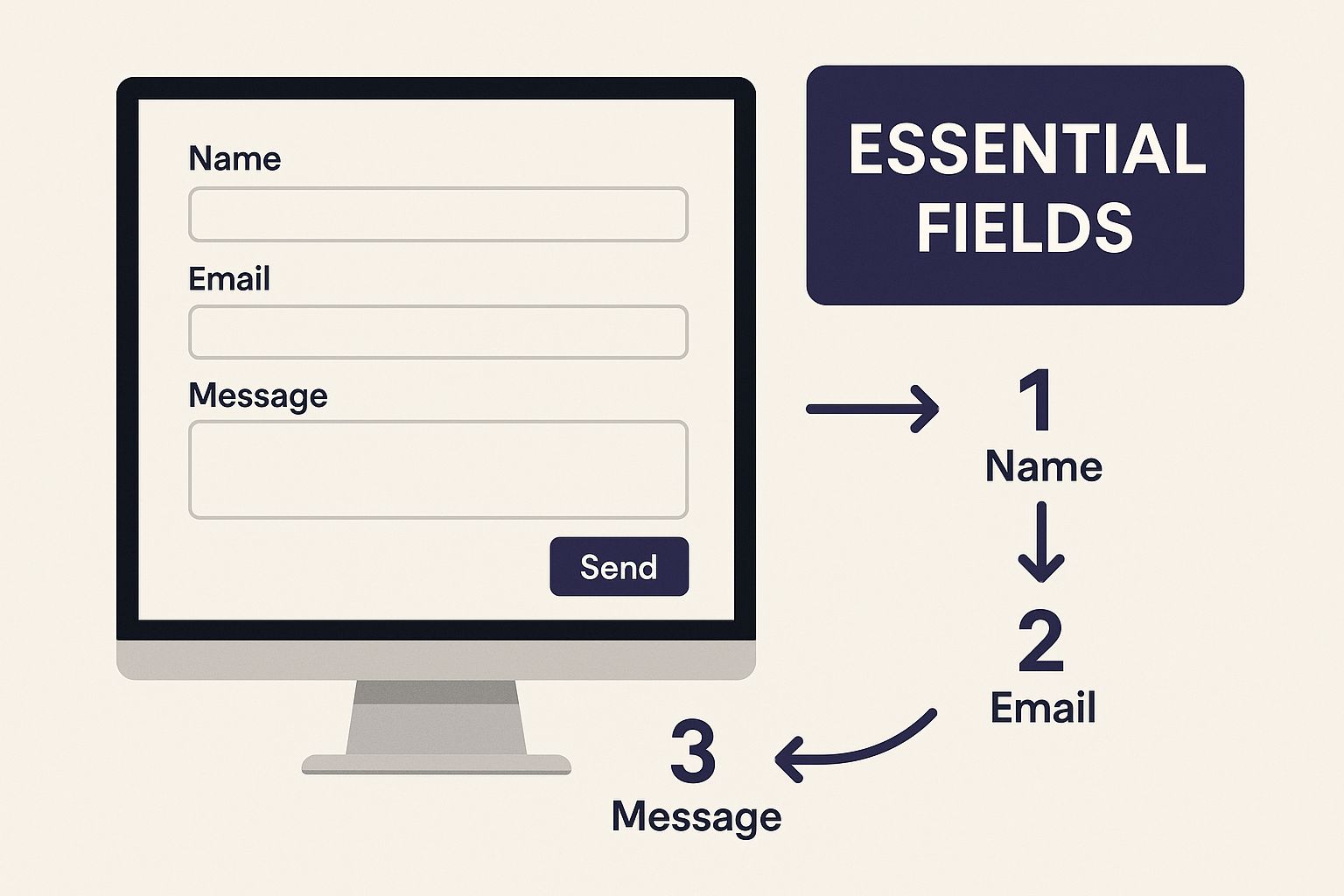
This infographic breaks down what makes a contact form both sleek and effective.

By keeping the interface clean and only asking for what you truly need, you make it that much easier for a client to hit "send." You can also check out our deep dive on the fundamentals of contact us page design for more ideas.
Add Your Physical Location and Hours
If you have a brick-and-mortar salon or spa, your location and hours are non-negotiable. Don't make potential clients dig around your site for this info. Putting it front and center on your contact page builds trust and boosts your local SEO, helping you show up in "near me" searches.
Actionable Insight: Always embed an interactive Google Map directly onto your page. This keeps users from having to leave your site to find directions, which means they're less likely to get distracted.
Make sure your hours are listed clearly and are always up-to-date, especially around holidays. It’s a simple step that manages expectations and prevents the frustration of someone showing up to a closed salon door. For a fantastic real-world example of how these elements come together cleanly, take a look at Alex Makeev's Contact Page.
Designing a Contact Form That Converts
When a potential client lands on your contact page, they are actively trying to reach you. The last thing you want is for them to get frustrated and leave because your contact form is too complicated. The design of this form is the final, crucial step in turning a curious visitor into a booked appointment.
A clunky, confusing form is the fastest way to lose a lead.
Put yourself in your client's shoes: a long form with a dozen questions feels overwhelming. The psychology is simple—fewer fields nearly always lead to more submissions.

Keep Your Form Fields Minimal and Smart
Your goal is to get just enough information to start a conversation. You can always ask for more details later. Every extra field you add is another hurdle that might cause someone to click away.
Actionable Insight: For most beauty businesses, this is all you really need to get started:
- Name: So you know who you’re talking to.
- Email Address: Your primary way to follow up.
- Phone Number: Perfect for quick confirmations or a friendly call.
- Message/Inquiry: An open text box for them to ask their question.
This approach shows you respect your visitor's time. Studies consistently show that reducing form fields boosts conversion rates. One company saw a 120% increase in conversions just by cutting their form from 11 fields down to four.
Make Every Detail Effortless
It's not just about the number of fields. Small design choices have a massive impact on whether your form feels easy to use or just plain annoying.
Use Clear and Simple Labels
Actionable Insight: Ditch the jargon. Instead of "Full Name," just use "Your Name." Instead of "Inquiry Type," a simple "How can we help?" feels more human. Always place the label directly above the input field—it’s the most user-friendly spot.
Design a Standout 'Submit' Button
Your call-to-action (CTA) button needs to be impossible to miss. Don't settle for a generic "Submit." Use action-oriented text that tells the user exactly what happens next.
Actionable Insight: Make your submit button feel like a satisfying final click. Use a bold, contrasting color that pops. Get creative with the text to build excitement—think "Book My Consultation," "Request an Appointment," or "Let's Chat!"
Implement Smart Spam Protection
Nothing kills the user experience faster than a clunky CAPTCHA that forces people to identify crosswalks or blurry street signs. Use modern, invisible methods like Google's reCAPTCHA v3, which works in the background without making legitimate clients jump through hoops.
Confirm the Connection with a Thank You Message
What happens after they hit send? This is just as important as the form itself. Don't leave them wondering if their message disappeared. A well-crafted thank you message confirms their submission and sets clear expectations.
Actionable Insight: After a user submits the form, either redirect them to a dedicated thank you page or display an on-page message. Something simple like, "Thanks for reaching out! We've received your message and will get back to you within 24 hours," works perfectly. This small step builds immediate confidence.
Optimizing for Mobile Users and Local Search
Your clients are likely booking appointments on their phones. If your Contact Us page is a nightmare on a small screen, you’re creating friction at the worst possible moment. A page that makes them pinch, zoom, and struggle to tap tiny buttons is a surefire way to lose a booking.
The reality is that more than half of all web traffic now comes from mobile devices. This isn't a trend; it's the standard. Your Contact Us page absolutely must be responsive, meaning it adapts beautifully to any screen size. Buttons need to be big enough for thumbs, text has to be readable, and your forms should be simple enough to fill out in under a minute.
Make Mobile Actions Effortless
Think about how you use your own phone. You want speed and convenience. Your Contact Us page should deliver that by turning static info into interactive, one-tap actions. This dramatically improves the user experience and encourages potential clients to connect with you right now.
Actionable Insight: Here are the non-negotiables for a mobile-friendly design:
- Click-to-Call Numbers: Your phone number shouldn't just be plain text. Make it a clickable link that immediately opens the phone's dialer.
- Click-to-Map Addresses: Do the same for your address. Link it directly to Google Maps or Apple Maps so a client can tap it and get directions to your business.
- Thumb-Friendly Forms: Design your forms with mobile in mind. Use large input fields, clear labels, and a big, bold submit button that’s easy to tap.
A mobile-optimized contact page isn’t just a nice-to-have; it's a fundamental part of great customer service. By making it effortless for clients to connect from their phones, you show them you value their time.
Connecting Design to Local SEO
Here's the best part: these mobile-friendly design choices do more than just make life easier for your clients—they directly fuel your local search engine optimization (SEO). Google’s algorithm prioritizes mobile-first experiences and rewards businesses that make it easy for local customers to find and contact them.
When you format your address correctly and make it a clickable map link, you're sending powerful signals to search engines that you're a legitimate local business. This helps you climb the rankings for important "near me" searches. A client searching for "lash extensions near me" is more likely to see your business if your contact page is set up for local discovery.
For a deeper dive into how these small tweaks boost your site's overall speed and search performance, check out our guide on website performance optimization tips. Every millisecond counts, especially for an impatient mobile user.
Advanced Tips to Build Trust and Book More Clients
Once you have the basics of your contact page nailed down, it's time to turn it from a simple form into a client-booking powerhouse.
These next steps are all about building trust before a potential client even hits “send.” This transforms a functional page into a magnet for your ideal customers. Choosing a beauty pro is a personal decision. By adding a human touch and glowing reviews, you’re giving them the reassurance that they’re in the right place.

Put a Face to the Name with Photos
Actionable Insight: Add a photo to build an instant connection. People connect with people, not with faceless brands.
A professional headshot of yourself or a friendly photo of your team signals that there are real, talented experts behind the screen. This makes a new client feel much more comfortable reaching out and makes your business feel more authentic and approachable.
Cut Down on Questions with a Mini FAQ
How many times have you answered questions about your cancellation policy or how to prep for an appointment?
Actionable Insight: Add a short, targeted FAQ section directly on your contact page. It cuts down on repetitive emails and saves you time.
Focus on the top 3-5 questions new clients always ask before booking. This shows you’re proactive and understand your clients' needs.
A few essentials to include might be:
- What is your cancellation policy? Get this out in the open to avoid awkward conversations later.
- Do I need to pay a deposit to book? This sets clear expectations and makes the booking process smoother.
- How should I prep for my appointment? This shows you’re invested in their results.
Answering these questions upfront removes barriers and makes it easier for them to book with you.
Your contact page isn't just a form; it's the start of a conversation. By anticipating their questions and showing off a little client love, you build a foundation of trust that gets potential clients genuinely excited to work with you.
Let Your Happy Clients Do the Talking
Nothing sells your services better than a glowing review from a happy client. Social proof is a powerful tool that tells a visitor, "Yes, you're making a great choice."
Actionable Insight: Don't make them go searching for your reviews. Bring your best ones right to your contact page.
You can easily do this by:
- Featuring a Standout Testimonial: Pull a short, powerful quote from a favorite client. Be sure to include their name to keep it authentic.
- Linking to Your Review Profiles: Add easy-to-spot links or badges to your Google Business Profile, Yelp, or any other platform where clients are raving about you.
This shows visitors you’re proud of your reputation and have a history of delivering incredible results. For a deeper dive into how all these pieces come together, check out our guide on creating an outstanding contact page design.
Common Questions About Contact Us Pages
When designing your site, a few questions always pop up about the contact page. Getting these details right can be the difference between a page that floods your inbox with new clients and one that just sits there. Let’s tackle some of the most common ones.
How Many Form Fields Is Too Many?
This is the golden question. The rule of thumb is less is always more.
Actionable Insight: Aim for 3-5 fields maximum. For most beauty businesses, all you really need is "Name," "Email," "Phone Number," and a "Message" or "Service of Interest" field. That’s it.
Every extra box you ask someone to fill out is another chance for them to leave. One study found that cutting form fields from 11 down to just four can boost conversions by 120%. Start with only what you absolutely need; you can gather more details when you connect with them personally.
Should I Include My Personal Phone Number?
This is a tough one, especially for solo practitioners. On one hand, offering a direct line is great for client service. On the other, using your personal number can erase any work-life boundaries.
Actionable Insight: Set up a dedicated business line. A service like Google Voice is a fantastic, free solution. It gives you a separate number that can forward calls to your personal phone and lets you set "office hours" so you aren't getting appointment texts at midnight. This keeps you looking professional while protecting your personal time.
Pro Tip: Whatever number you use, always make sure it's a "click-to-call" link on your site. This is a small detail that makes a huge difference, allowing mobile users to dial you with a single tap. Don't make them copy and paste!
What's Better: A Contact Form or Just an Email Link?
Putting your email address directly on the page feels simpler, but a contact form is almost always the better choice.
Here’s why:
- Avoid Spam: Displaying your email address openly is an invitation for bots and spammers to harvest it.
- Get the Info You Need: A form guides clients to provide the specific details you need, which means more organized, qualified inquiries for you.
- Look More Professional: A clean form creates a polished, streamlined experience. It shows you've put thought into your client communication process.
Ready to build a contact page that doesn’t just look stunning but actually works hard to get you bookings? gohappybeauty creates beautiful, SEO-optimized website templates designed specifically for beauty pros like you. Start building your dream website today!
Grow your beauty business
Our focus is, and always will be, helping you improve your online presence and generate more business from your website. That is what we do, for you.

