
When it comes to your website, your contact page is more than just a place to list your email and phone number. It’s a strategic final touchpoint, the last step that guides a curious visitor toward becoming a paying client.
For a beauty business, think of it as your digital front desk. It needs a thoughtful layout, clear calls-to-action, and trust-building elements that make it incredibly easy—and even inviting—for someone to get in touch.
Why Your Contact Page Is a Conversion Engine
Many business owners treat their contact page like a digital afterthought—necessary, but unexciting. However, this page is secretly one of your most powerful tools for getting clients.
Viewing your contact page as just a final hurdle before a booking is a costly mistake. It's a crucial business asset. A well-designed contact page is your digital handshake, the moment you build enough trust to turn a casual browser into a loyal client. It’s often the last stop for someone who is already interested in your services but just needs that final nudge of reassurance.
This single page can be the difference between a fully booked schedule and a phone that never rings.
The True Cost of a Poor Design
A confusing or untrustworthy contact page actively costs you leads every single day. The data is clear: web design has a massive impact on 94% of a potential customer's first impression of your business. When that bad impression happens on the page where they’re supposed to connect with you, the damage is immediate.
For a salon owner, that’s like a potential client walking up to your front door, finding it locked during business hours, and deciding to go to your competitor down the street forever.
From Utility to Opportunity
The key is to reframe the page's purpose. It’s not just for contact; it's for connection. A great user experience on this one page can boost your conversion rates by an incredible 400%. This is where you transform someone’s passive interest into active engagement.
A great contact page doesn't just answer the question, "How can I reach you?" It answers, "Why should I reach out to you?" by building confidence and making the whole process feel effortless.
By providing clear options, setting expectations for when they’ll hear back, and reassuring visitors that a real, helpful person is on the other side, you remove all the psychological barriers that stop people from making contact. This entire approach is fundamental to building websites that convert leads into customers.
Ultimately, this page is more than a form. It’s the beginning of a client relationship, and a thoughtful design ensures that relationship starts on the right foot.
Building Your High-Performing Contact Page

A great contact page is a client-focused hub designed to welcome every type of customer, whether they want to call, live chat, or send a quick message. This section provides a step-by-step guide to building your page, piece by piece.
Consider your clients' habits. Some will want to call for a last-minute appointment, while others prefer using live chat while multitasking at work. A winning contact page design gives them options, ensuring no potential booking is lost because their preferred method wasn't available. This approach builds trust and shows you’re an accessible, client-first business from the start.
Offer Multiple Ways To Connect
The foundation of a high-performing contact page is providing several ways for clients to get in touch. Don't force everyone down the single path of a contact form. Instead, empower them with choices.
Here are the actionable steps to implement this:
- Add a Click-to-Call Phone Number: For clients on mobile, talking to a real person is often the fastest way to get an answer. To implement this, make your phone number a clickable link (
tel:123-456-7890) so they can dial with a single tap. - Display a Professional Email Address: Some people prefer email for booking confirmations or detailed questions. Displaying an email like
[email protected]adds credibility. - Integrate Live Chat: A live chat feature is excellent for capturing leads with quick questions who want an immediate answer. It's perfect for clarifying service details or checking same-day availability.
Actionable Tip: By offering a few contact methods, you cater to different personalities and levels of urgency. This simple act of flexibility can significantly boost the number of inquiries you receive.
Beyond these core three, consider your own business. If you are very active on Instagram, add a link to your DMs. If you use a specific booking app, link directly to it. The goal is to make getting in touch completely effortless.
Guide Local Clients To Your Door
For any beauty business with a physical location, your contact page has an even bigger job: driving foot traffic. You must make it incredibly easy for clients to find you.
Here's how to do it:
- Embed a Google Map: Don't just list your address in plain text. Embed an interactive Google Map on your page. This allows clients to see exactly where you are and get directions straight from their phone, removing a huge point of friction for first-time visitors.
- Clearly Display Business Hours: Right next to the map, clearly display your operating hours. This prevents the disappointment a client feels when they arrive to a locked door. Be specific, listing hours for each day and any special holiday closures. This transparency shows you respect your clients' time.
Build Trust With Personal Touches
A truly great contact page design uses small details to build massive trust. This is how you transform a generic page into a warm, personal invitation to connect.
Here are two powerful, actionable ways to build trust:
- Include a Team Photo: Add a photo of yourself or your team. When a potential client sees the friendly faces behind the brand, it instantly makes your business feel more human and approachable. It's a small touch that says, "We're real people, and we can't wait to meet you."
- Set Clear Expectations: Add a simple, reassuring note below your contact form like, "We read every message and will get back to you within 24 business hours." This manages their expectations and assures the client their message hasn't disappeared into a digital black hole. For those building a site from scratch, finding the best website builder for massage therapists and other beauty pros can make adding these trust-building features a breeze. For more technical tips, you can review this detailed documentation on creating effective 'Contact Us' experiences.
Designing a Form That People Actually Want to Fill Out
The contact form is the make-or-break moment on your page. It's the exact spot where a curious visitor decides to become a paying client. A clunky, confusing form is a dead end. A smart one feels like an easy, natural conversation.
Getting your form right isn’t about adding fancy features; it’s about stripping away friction. Here are practical, human-centered design tweaks that guide users smoothly toward hitting that "send" button.
Think Mobile-First, Always
For any beauty business, your clients are most likely finding you on their phones. This makes a single-column layout for your form non-negotiable. Forcing someone to pinch and zoom to type their name is a guaranteed way to make them give up. A clean, single column creates a logical top-to-bottom path, making it easy to tap through each field.
Key Takeaway: A single-column form is a necessity. It ensures your form is easy to use on any device, which is crucial for capturing leads from clients on the go.
This chart drives the point home, showing that a contact form is the number one way potential clients prefer to get in touch.
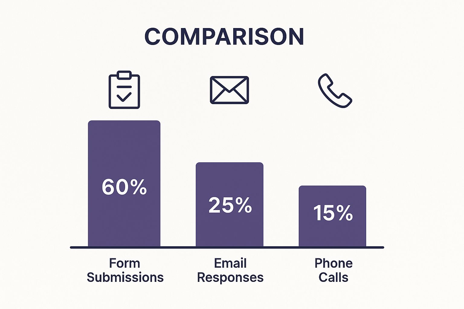
The data is clear: optimizing your form is the single most impactful thing you can do on your contact page because it’s the tool people use most.
Little Design Choices That Make a Big Difference
Beyond the layout, a few small but powerful tweaks can dramatically increase how many people complete your form.
- Use Helpful Placeholder Text: Instead of a boring "Name" label, use placeholder text inside the field to offer a friendly prompt. For the message box, try something like, "Tell us which service you're interested in!" This nudge can be all someone needs to start typing.
- Get Smart with Conditional Logic: This creates a dynamic form that adapts based on a user's answers. For example, if a client selects "Bridal Makeup" from a dropdown, a new field can appear asking for the wedding date. This keeps the initial form short and approachable by only asking for relevant information.
- Ditch the Old-School CAPTCHA: Outdated CAPTCHAs are frustrating. A modern spam solution like a honeypot field—which is invisible to users but catches bots—is a far superior choice. It protects you from spam without harming the user experience.
Contact Form Design Choices Impact on User Experience
Making the right choices for your form's design is critical. The table below breaks down common elements, showing how different approaches affect the user's journey—and your conversion rates.
| Design Element | Recommended Approach (Pro) | Approach to Avoid (Con) |
|---|---|---|
| Layout | Single-column: Creates a clear, linear path that's easy to follow on any device, especially mobile. | Multi-column: Forces users to scan in a Z-pattern, which is confusing and increases the chances of skipping fields. |
| Form Fields | Fewer fields (3-5 max): Asks for only essential information upfront, feeling less intimidating and boosting completion rates. | Too many fields: Overwhelms the user and feels invasive, leading to high abandonment rates. |
| Labels & Placeholders | In-field placeholders: Offers gentle guidance (e.g., "What service are you interested in?") to help users start. | Vague labels: Generic labels like "Message" or "Details" can leave users unsure of what to write. |
| Spam Protection | Honeypot field: An invisible, user-friendly method that traps bots without adding any steps for real users. | Traditional CAPTCHA: Creates significant friction and frustration, causing many legitimate users to abandon the form. |
| CTA Button | Descriptive text: Uses clear, action-oriented text like "Book My Consultation" or "Get a Quote" to set expectations. | Generic text: Vague buttons like "Submit" or "Send" are uninspiring and have lower click-through rates. |
| Error Messages | Inline & specific: Clearly highlights the exact field with an error and explains what's wrong (e.g., "Please enter a valid email address"). | Vague or delayed errors: Showing a single error message at the top after submission forces the user to hunt for the mistake. |
Every choice you make should be aimed at making the process smoother and more intuitive for your potential client.
Many of the same principles for creating user-friendly forms can be found in guides for designing effective customer feedback forms. The core idea is the same: focus on clarity and ease of use, and you'll see a real improvement in the number of inquiries that land in your inbox.
Contact Page Designs That Actually Convert

We’ve covered the "what" and "how." Now, let's look at real-world examples to see these ideas in action. This section will break down why certain designs are so effective, providing strategies you can apply to your own beauty business website.
The Magic of Clarity and Focus
One of the biggest mistakes business owners make is creating a contact page that tries to do too much. A great design clears the path and removes every distraction.
By cutting out distractions like outbound links, making their unique selling points clear, and adding relevant images, they saw a 201% increase in enquiry form submissions. This wasn't an accident; it was a deliberate strategy to simplify the user's journey.
This proves that a simpler, more focused page is almost always the winner.
Smart Tactics from High-Converting Pages
Here are actionable ideas you can borrow from the best contact pages for your own site today.
- Humanize the Experience: Use playful language and inviting visuals. For your salon, this could be as simple as adding a photo of your smiling team to make your page feel warm and approachable, rather than like a cold, corporate form.
- Offer Multiple, Clear Paths: Not everyone is reaching out for the same reason. Provide distinct buttons for different needs, like "Book an Appointment" and "Ask a Question." This directs the user to the right place and sets the expectation that the right person will handle their inquiry.
- Set Clear Expectations: No one likes sending a message into a black hole. Add a sentence stating your response time upfront (e.g., "We'll get back to you in 1-3 business days"). This small piece of text builds a huge amount of trust by managing expectations from the start.
Building Your Page for Success
You don't need a huge budget to implement these ideas. Most of these powerful techniques are about making smart choices, not buying expensive tools. A well-designed template can be the perfect starting point.
If you're starting fresh or upgrading, exploring a gallery of small business website templates can give you a major head start. Look for layouts that are clean, mobile-friendly, and easy to customize with your own personal touches, like team photos and trust-building copy.
The main takeaway is that every element on your contact page needs a purpose. Ask yourself: does this build trust? Does this make things easier? Does this clarify the next step? If the answer is no, it probably doesn’t belong on your page.
Building Trust to Maximize Conversions

An attractive page is one thing, but a trustworthy page is what turns a visitor into a booked client. As someone is about to share their personal information, you need to build confidence.
Small, thoughtful additions to your contact page design can make a huge difference. They are digital reassurances that tell potential clients your business is legitimate, professional, and safe. This isn't just about looking good; it's about making people feel secure enough to take the next step.
Add Trust Signals Near Your Form
The space around your contact form is prime real estate for building confidence. When a user is ready to type their details, their subconscious is scanning for signs of trustworthiness. Placing trust signals here is a simple way to overcome hesitation.
Here are actionable signals you can add:
- Security Badges: If you use security software (like Norton or McAfee), display those badges. They are a quick visual cue for safety.
- Customer or Press Logos: If you've been featured in a local publication or worked with well-known businesses, adding their logos provides instant social proof.
- A Clear Privacy Policy Link: A simple link that says "We respect your privacy" right under the form is a powerful move. It shows transparency and reassures users their data won't be spammed.
Write Microcopy That Converts
Microcopy refers to the small pieces of text on your page that guide users, and it’s especially powerful on buttons and form fields. Your choice of words can change a user's perception and their willingness to click.
Consider the difference between a generic "Submit" button and one with compelling, action-oriented text. One feels passive; the other creates excitement and makes the benefit clear.
Pro Tip: Your call-to-action button should complete the sentence "I want to…" For example, a button that says "Get My Free Quote" lets the user think, "I want to get my free quote." This aligns the action with their intention.
Here are powerful alternatives to the standard "Submit" button:
| Instead of This… | Try This… | Why It Works |
|---|---|---|
| Submit | Get My Free Consultation | It zeroes in on the valuable outcome for the client. |
| Send | Book My Appointment | The language is direct and aligns with their ultimate goal. |
| Go | Request a Callback | This sets a clear expectation of what's going to happen next. |
| Contact Us | Get in Touch with an Artist | It feels way more personal, connecting them with a real person, not a faceless company. |
This isn’t just playing with words; it’s making your contact page design feel more like a helpful conversation and less like filling out paperwork.
Perfect the Post-Submission Experience
What happens right after a user clicks "send" is just as important as the form itself. This is your first chance to confirm their action, manage their expectations, and continue building the relationship. A bland "Message sent" is a huge missed opportunity.
A great thank-you message or confirmation page should do these three things:
- Confirm Receipt: Start with a clear, friendly confirmation like, "Thanks for reaching out! We've received your message." This immediately eases any anxiety about whether the form worked.
- Set Clear Expectations: Tell them exactly what to expect next. A simple sentence like, "A member of our team will get back to you within 24 business hours," is incredibly powerful. It shows you're organized and respect their time.
- Guide Them to More Content: Don't let the interaction end there. Use this moment to point them toward other useful parts of your site. You could link to your service menu, your latest blog post, or your Instagram profile.
By nailing this post-submission experience, you turn a simple form submission into a seamless and reassuring brand interaction.
Common Questions About Designing Your Contact Page
Even with a solid plan, you might have specific questions as you refine your contact page design. Here are clear, actionable answers to common queries from beauty professionals.
How Many Fields Should My Contact Form Have?
The golden rule is to keep it simple. Start with the absolute minimum you need: 3-5 fields is the sweet spot. For most beauty businesses, all you really need is their name, email, and a message box.
Every extra field adds friction. You can always gather more information, like preferred appointment times, during your follow-up. The goal of the form is to make that first step as easy as possible.
Actionable Tip: Start small. Your form is a handshake, not a full client intake. You're just opening the door for a conversation.
Should I Include My Phone Number and Address?
Yes, absolutely—if it makes sense for your business. A phone number and physical address are huge trust signals. Even if most clients use the form, seeing that information proves you're a real, legitimate business.
If you run a local salon, spa, or studio, your address and an embedded map are non-negotiable. You have to make it effortless for people to find you.
What’s Better Than a Standard CAPTCHA for Spam?
Modern spam prevention is much more user-friendly than deciphering squiggly letters.
A "honeypot" field is an excellent solution. It's a hidden form field that is invisible to humans but attracts spam bots. When a bot fills it out, the submission is blocked without your real customers ever being bothered.
Another great option is Google's reCAPTCHA v3. It works quietly in the background, analyzing user behavior for spam-like activity without requiring a puzzle. If you have other technical questions, you can find more answers on our detailed FAQs page.
Ready to create a beautiful, high-converting contact page that brings in more clients? gohappybeauty offers stunning, SEO-optimized website templates designed specifically for beauty professionals. Start building your dream website today.
Article created using Outrank