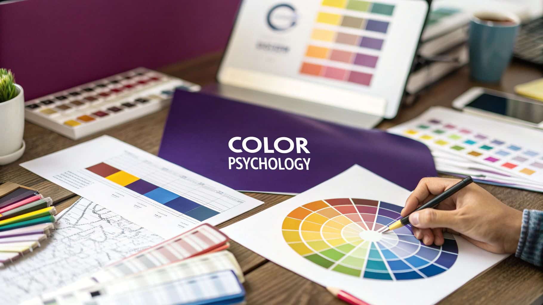
When you're building a brand, picking colors is more than just choosing pretty shades. Color psychology in branding is about using color strategically to shape how customers see and feel about your business. It’s less about your personal favorite color and more about selecting a palette that communicates your brand's core message, evokes the right emotions, and creates an instant connection with your ideal audience.
The Hidden Language of Your Brand Colors
Think of your brand's color palette as its first handshake. It happens in an instant, long before a potential client reads a single word on your website or Instagram post. This split-second, non-verbal communication is incredibly powerful. It sets the tone for everything that follows.
The colors you pick are a silent messenger for your brand's personality. They can instantly signal whether your business is luxurious and exclusive, fun and energetic, or calm and organic. In fact, research shows that up to 90% of snap judgments made about products can be based on color alone. This is a critical insight for any business owner.
Why Color Is a Business Tool
It’s tempting to view color as a purely aesthetic choice—something you handle after the "real" business decisions are made. But that's a massive missed opportunity. Your brand colors are a foundational business tool that directly impacts how customers feel about you. A killer color palette isn’t just about looking good; it's about being understood.
For a business, especially in the beauty industry, that understanding is everything. Your colors can:
- Communicate Core Values: Are you all about natural, plant-based ingredients? Earthy greens and browns will communicate that message far more effectively than a flashy neon pink ever could.
- Trigger Specific Emotions: Want clients to feel blissfully relaxed the moment they think of your spa? Soft blues and lavenders are your best friend for creating a serene, pampering vibe.
- Influence Purchasing Decisions: The right colors build trust, create a sense of urgency, and make your products feel more desirable, which translates directly to your bottom line.
Actionable Insight: Treat color selection as a key business decision. The colors you choose are the visual cue that tells your audience who you are, what you stand for, and what they can expect from you.
This guide is designed to give you actionable steps, moving beyond what just looks good. We’re going to show you how to look at color through a strategic lens. By understanding the basics of color psychology in branding, you can make smart, informed decisions that attract the right clients and build a brand that truly sticks with them. Let’s dive in.
How Colors Shape Customer Perceptions
Colors do more than just exist—they communicate. Every single hue carries its own set of emotional and psychological associations, acting like a subconscious shortcut that shapes how a customer feels about your brand. This isn't just about memorizing "blue means trust"; it's about understanding the deeper story that your colors tell every time someone sees them.
Think about it. Blue often brings up feelings of stability, expertise, and calm. That's exactly why you see it used by tech firms and financial institutions—they want you to feel secure and confident. On the flip side, a vibrant red isn't just "bold." It screams urgency and excitement, making it a powerhouse for a flash sale or a call-to-action button.
These gut reactions are deeply ingrained in us. Understanding this is the first step in moving from just picking pretty colors to making strategic branding decisions that truly connect with your ideal clients. Your color palette becomes the silent storyteller for your brand's personality.
The Science of First Impressions
The impact of color is immediate and incredibly powerful. The last time you stumbled upon a new product online, your gut reaction was probably swayed by its color before you even read a single word of the description. That's not a coincidence—it's psychology at work.
In fact, studies show that people form initial judgments about a product within the first 90 seconds of seeing it. And a staggering 62% to 90% of that split-second assessment is based on color alone. What's more, some research suggests that 60% of people will accept or reject a new product based entirely on its color. This shows how critical your brand's palette is for grabbing attention and making a positive first impression.
Decoding the Emotional Spectrum
To make smart choices, you need a practical guide to what different colors are actually saying. While feelings about color can vary, there are widely accepted meanings that serve as a fantastic starting point for any business owner.
Here’s a quick rundown of common colors and the feelings they usually bring to mind:
- Red: Passion, energy, urgency, and excitement. It’s an attention-grabber, perfect for calls to action, sales, and brands with a high-energy vibe.
- Blue: Trust, stability, calm, and professionalism. It’s a go-to in the corporate and tech worlds for its ability to build a sense of security and reliability.
- Green: Nature, health, growth, and tranquility. A no-brainer for wellness spas, organic skincare lines, and any beauty business focused on natural ingredients.
- Yellow: Optimism, happiness, and youthfulness. It’s great for brands that want to feel friendly, cheerful, and approachable.
- Orange: Friendliness, enthusiasm, and creativity. Orange mixes the energy of red with the cheerfulness of yellow for an inviting and confident feel.
- Purple: Luxury, wisdom, and creativity. Historically tied to royalty, purple is a fantastic choice for high-end beauty products or brands aiming for sophistication.
- Pink: Femininity, playfulness, and romance. Often used for brands targeting women, its meaning can shift from soft and nurturing to bold and modern, all depending on the shade.
- Black: Power, elegance, and sophistication. A staple for luxury brands, black communicates exclusivity and timeless style.
Actionable Insight: Your brand color isn't just a background detail; it's the emotional stage for every message you send. Choose a color that sets the right tone for your brand's value and promise.
To get the most out of your brand colors in your marketing, it’s also key to understand how color grading can evoke specific feelings in your photos and videos. This allows you to intentionally shift the colors in an image to create a specific mood, ensuring your visuals are perfectly in sync with the emotions you want your brand to convey.
The Emotional Spectrum of Brand Colors
Choosing the right color is all about balancing its psychological meaning with how it fits into your industry. To help you connect your brand's personality with the perfect palette, use this table as your go-to cheat sheet.
| Color | Common Psychological Associations | Best For Industries Like | Potential Negative Connotations |
|---|---|---|---|
| Red | Urgency, Passion, Excitement, Energy | Food, Entertainment, Clearance Sales | Danger, Aggression, Anger |
| Blue | Trust, Security, Stability, Calm | Technology, Finance, Healthcare, Salons | Coldness, Unfriendliness, Aloofness |
| Green | Health, Nature, Growth, Prosperity | Wellness, Beauty, Environmental, Spas | Blandness, Stagnation, Envy |
| Yellow | Optimism, Youth, Happiness, Warmth | Food, Creative Agencies, Children's Brands | Caution, Anxiety, Cheapness |
| Purple | Luxury, Creativity, Wisdom, Royalty | High-End Beauty, Cosmetics, Spirituality | Arrogance, Extravagance |
| Black | Sophistication, Power, Elegance, Luxury | Fashion, Luxury Goods, High-End Salons | Mourning, Oppression, Coldness |
| White | Cleanliness, Simplicity, Purity, Modernity | Skincare, Health, Minimalist Brands | Sterility, Emptiness, Isolation |
Once you start looking at colors this way, they stop being just decorative choices. They become powerful, strategic tools in your branding toolkit, ready to help you tell your story and connect with customers on a much deeper level.
Building Your Brand Palette Step by Step
Knowing the theory behind color psychology is one thing, but turning that knowledge into a hard-working brand palette is another. This is where you move from admiring colors to making strategic choices that build a powerful brand identity. Here is a simple, actionable process to follow.
Ready to build a color palette that connects with your customers? Let’s walk through it, step-by-step.
Step 1: Define Your Brand Personality
Before you even glance at a color wheel, you need to define your brand’s personality. If your brand walked into a room, how would you describe it? Is it sophisticated and chic, or is it fun, youthful, and energetic?
Answering this question is the foundation of your entire color strategy. The emotions and traits you land on will be your guide for every color choice.
Your Action Step: Brainstorm and write down a list of adjectives that capture your brand’s essence. Ask yourself:
- Is my brand… innovative and modern, or traditional and classic?
- Do I want to be seen as… luxurious and exclusive, or affordable and accessible?
- Is the vibe… calm and serene, or bold and vibrant?
Jot down at least five core personality traits. These words will act as a filter for every color you consider, ensuring your final palette feels authentic.
Step 2: Understand Your Target Audience
Your brand isn’t just for you; it’s for your clients. And the colors that appeal to a young, trend-focused crowd might miss the mark with an older, more established clientele. Research shows that age, gender, and cultural background all play a role in color perception.
For example, men often lean toward bolder colors, while women tend to gravitate toward softer shades. This isn't about stereotypes, but about being aware of general preferences to better connect with your core demographic.
Your Action Step: Dig into the demographics and psychographics of your ideal client. What do they value? What other brands do they love? Look at those brands for clues about the visual language that speaks to them.
Actionable Insight: Your brand palette isn't just for you—it's for your customers. Choosing colors that resonate with them is one of the most direct ways to build an immediate, subconscious connection.
Step 3: Analyze Your Competitors
Now that you know who you are and who you're talking to, it's time to see what your competitors are doing. This analysis isn’t about copying; it’s about finding an opportunity to stand out. This is based on the Isolation Effect—a psychological principle stating that an item that is different from its surroundings is more likely to be remembered.
Your Action Step: Look at other businesses in your space. What colors are they using? You'll likely spot trends. Perhaps every local spa uses serene blues and greens. This is valuable information.
You have two strategic options:
- Align with Industry Norms: Using similar colors can be a shortcut to signal to customers what you do.
- Differentiate Yourself: Choosing a completely different color can make you instantly memorable and help you carve out a unique position in the market.
If the market is flooded with calming greens, perhaps a sophisticated palette of deep plum and gold is your chance to cut through the noise.
Step 4: Choose Your Colors and Create Balance
It’s finally time to pick your colors. A strong palette needs structure and balance. A great tool for this is the 60-30-10 rule, a classic design framework that ensures your colors work together harmoniously.
Here’s a quick visual to help you see how certain colors connect to different feelings, which will help you pick shades that match your brand’s message.

This map shows how colors like red (passion), blue (trust), and green (nature) are hardwired to powerful emotional responses.
Your Action Step: Build your palette using the 60-30-10 rule:
- Your Primary Color (60%): This is your brand's main personality. It will cover the most space on your website and other materials.
- Your Secondary Color (30%): This color should complement your primary hue and be used for things like headlines and subheadings to create contrast.
- Your Accent Color (10%): This is your pop of color. Use this eye-catching shade for calls-to-action (CTAs), buttons, and anything you want to draw attention to.
This structured approach makes your branding look professional and cohesive. Using these colors consistently is how you build instant brand recognition. Once your palette is set, see how these principles work in practice by learning how to create a professional website.
Real-World Examples of Color Psychology in Action
Theory is a great starting point, but seeing how iconic brands use color psychology provides concrete examples of its power. These companies make calculated moves designed to trigger specific feelings and build billion-dollar empires.
Their choices aren’t random—they're a core piece of their brand identity, reinforcing their message at every single touchpoint. Let’s break down how a few of the greats do it.
Tiffany & Co. – The Color of Exclusivity
When you see that distinct, robin's-egg blue box, you don't just see a color—you feel it. It’s luxury, elegance, and excitement all in one. Tiffany & Co. has so completely owned this shade (Tiffany Blue) that the color itself has become a synonym for the brand. It’s a perfect example of using color to create an instant link to high-end quality and timeless romance.
This isn’t just any blue. It's a light, calming shade that also feels rare and special, perfectly reflecting the brand's promise of exclusive jewelry. That color alone triggers anticipation and desire, making the unboxing experience an event in itself.
Coca-Cola – The Power of Red
Coca-Cola's vibrant, energetic red is one of the most recognizable colors on the planet. The brand uses this powerhouse hue to evoke feelings of happiness, excitement, and energy. Red is an attention-grabbing color that can even stimulate appetite and create a sense of urgency—the perfect vibe for a refreshing drink.
Their consistent use of red has forged an unbreakable bond between the color and the experience of drinking a Coke. It’s a classic case study in how a single, bold color can represent core brand values like joy and togetherness. This consistent application is a key reason color psychology in branding is so powerful for building long-term recognition.
Actionable Insight: Color is a silent ambassador for your brand. When used consistently, it builds a powerful, unspoken connection with your audience, making your brand instantly recognizable and memorable.
This strategy pays off. Research shows that a strong, consistent color strategy can boost brand recognition by up to 80%. The right colors create deep emotional responses, making your brand stick in the minds of your customers. You can dive deeper and learn more about how color influences consumer perception.
Whole Foods – Communicating Natural Quality
Whole Foods built its brand on the promise of natural, organic, and high-quality products. Their primary brand color? Green, of course. This choice is no accident. Green is universally tied to nature, health, and freshness. It instantly communicates the company’s core values without a single word.
By using various shades of green throughout its stores, packaging, and marketing, Whole Foods constantly reinforces its identity as a trusted source for healthy living. The color creates a calm, reassuring atmosphere that makes shoppers feel good about their purchases.
These examples prove that color is a strategic language. For beauty businesses, these lessons are invaluable. Whether you’re designing a logo, a physical space, or your online presence, your color choices are fundamental. Picking the right palette is a cornerstone of effective hair salon website design, where you need to instantly communicate your salon's unique vibe.
Applying Your Brand Colors for Total Consistency
You've landed on a brilliant color palette—but that's only half the battle. If those colors aren't used consistently, they're just pretty shades without a purpose. Consistency is what turns your thoughtful choices into a brand that people instantly recognize and trust.
When a client sees the same cohesive colors on your logo, website, Instagram grid, and product packaging, it sends a powerful message: you're professional, polished, and reliable. This repeated exposure cements your brand in their mind. Without it, your brand can feel scattered and confusing.
Creating a Simple Brand Style Guide
To keep everything unified, you need a single source of truth for your brand's visuals. This is where a simple style guide comes in. Think of it as the rulebook for your brand, ensuring that you (and anyone you work with) use your colors perfectly.
Your guide doesn't need to be complex. At its core, it just needs to document the specific color codes for every scenario. This removes guesswork and keeps your colors exact, whether on a screen or a printed flyer.
Actionable Insight: A style guide is your brand’s visual compass. It ensures every touchpoint, from an Instagram post to a business card, points back to the same strong, unified identity.
Your Action Step: Create a one-page document and include these essential color codes:
- HEX Codes: For all your digital assets, like your website and social media graphics (e.g.,
#FFFFFF). - RGB Values: Also for screens, representing colors with a mix of Red, Green, and Blue (e.g.,
RGB(255, 255, 255)). - CMYK Values: Crucial for anything printed, like flyers or packaging, based on Cyan, Magenta, Yellow, and Black inks.
Performing a Quick Color Audit
Once your style guide is ready, it's time for a quick color audit. This is a simple checklist to help you spot inconsistencies across all your brand touchpoints.
Your Action Step: Review all the places your clients interact with your brand. Do your colors tell the same story everywhere?
Your audit should cover these key areas:
- Digital Presence: Does your website use the correct HEX codes? Are your social media profiles on-brand? This is a huge part of an effective strategy for website design for salons.
- Physical Materials: Are your business cards, brochures, and in-store menus using the right CMYK values for a polished look?
- Signage and Environment: Your physical space is a massive part of your brand experience. Check your signs and decor for consistency. Find actionable business sign ideas to make sure your brand pops inside and out.
This process ensures the emotional connection you built with color psychology in branding isn't lost due to inconsistent application. It’s the final step to building a brand that truly sticks.
Common Color Psychology Mistakes to Avoid
Picking brand colors is about more than finding shades that look good together. It’s about avoiding common traps that can derail your brand’s message. Here are some easily avoidable mistakes to watch out for.
The most common one is simply choosing your favorite color. You might love neon green, but it probably won't communicate the calm, luxurious vibe your spa clients are looking for. Your brand colors must be a strategic business decision, not a personal preference. Focus on your brand’s personality and what resonates with your target audience.
Overlooking Cultural Context
Colors don't mean the same thing everywhere. Forgetting this can lead to major miscommunications. In Western cultures, white symbolizes purity, but in many Eastern cultures, it's the color of mourning. If you have a global or diverse audience, do your homework to ensure your message is received as intended.
Another pitfall is using too many colors. A multi-color palette can seem vibrant, but overdo it, and your brand can look chaotic and unprofessional. Sticking to a structured palette, like the 60-30-10 rule, keeps your design looking balanced and clear.
Actionable Insight: Blindly chasing color trends can make your brand look dated in a year. A timeless palette rooted in your brand’s identity will always outlast a fleeting Pantone fad.
Forgetting Accessibility and Ignoring Trends
This is a must. Ensuring your colors are accessible is critical for readability. Low-contrast combinations, like light gray text on a white background, can be unreadable for visually impaired users. Always run your color pairings through a contrast checker. It's a simple step that makes your brand inclusive.
Finally, while you shouldn't copy big brands, you should pay attention to industry trends. Their color choices are often backed by data. For instance, around 33% of the world's leading brands use blue to build trust. And in luxury markets, about 28% use black to communicate sophistication. Knowing these patterns helps, but your choices must feel authentic to your brand. Dig into the research on the role of color in branding and marketing to better understand these trends.
Got Questions About Brand Colors? We've Got Answers.
Moving from color theory to a real-world palette can bring up questions. It's normal to feel a little stuck when finalizing your shades. Here are answers to common questions business owners ask when choosing brand colors.
How Many Colors Should I Actually Use?
While there's no single magic number, a balanced and professional palette usually has three to five colors. The 60-30-10 rule is a fantastic, easy-to-follow framework for creating visual balance.
Here’s the breakdown for implementation:
- 60% Primary Color: This is your main color that sets the overall mood.
- 30% Secondary Color: This complements your primary color, adding depth and visual interest.
- 10% Accent Color: Use this pop of color for important elements like call-to-action buttons.
This structure helps you avoid a chaotic look and guides your customer's eye where you want it to go.
What if My Favorite Color Doesn't Fit My Brand's Vibe?
This is a common hurdle. It’s essential to separate personal preference from what’s strategically right for your brand. You might love lavender, but if you’re launching an edgy, high-energy lash brand, that soft, calming purple will send a mixed message.
Actionable Insight: The goal isn't to create a color palette you love, but one that your ideal client will connect with instantly. Your brand's personality and target audience must come first.
Always circle back to the core adjectives you chose for your brand. Does the color align with "bold," "natural," or "luxurious"? If not, it's not the right fit, no matter how much you adore it.
Can I Just Change My Brand Colors Later On?
Technically, yes, but it's a much bigger deal than just swapping a few hex codes. A rebrand can confuse loyal customers and weaken the brand recognition you’ve worked so hard to build. Consistency is the secret sauce for creating a memorable, trustworthy identity.
Changing your colors should be reserved for a major business pivot or a total brand refresh. It’s far more effective to invest time upfront to choose a timeless palette that represents your brand’s mission from the start.
How Do I Find the Exact Codes for My Colors?
Getting specific color codes is non-negotiable for keeping your brand looking polished and consistent everywhere. Luckily, you don't need to be a design expert to find them.
There are amazing, user-friendly tools available. Free options like Adobe Color and Coolors are fantastic for building palettes and grabbing the exact HEX, RGB, and CMYK codes you'll need for your brand style guide. This simple step is what separates amateur branding from professional.
Ready to create a stunning online presence for your beauty business? gohappybeauty provides beautiful, SEO-optimized websites designed specifically for salon and spa owners. Build your dream website today!